--- Bing Image Creator “Daft Punk French electronic music duo, you can see a reflection of a burning earth in their helmet visors, digital art”
Last month’s FT article from Kenza Bryan and Steven Bernard also included this impressive chart2 putting February into context:
This is a staggering amount of information to display, and there are some really smart design choices here. This is all detailed by Steven Bernard in the FT’s series: “The Climate Graphic: Explained”.
Compare it with the chart Copernicus provided:
Or the BBC:
Both very clear. Even so, the balance of clarity and detail in Bernard’s chart helps make sense of the terrifying spaghetti in a quite unique way:
Splitting the data across five decadal charts makes the increase in temperatures over the period more apparent. Previously this pattern would have been harder to see within the tangle of 55 lines.
Reinforcing the temperature trend is the colour gradient: this is a technique called ‘double encoding’ — the colour of the lines reflects the same information as the position of the line on the chart.
Steven Bernard, The Climate Graphic: Explained, 10/03/2024
Before we get too carried away with appearance, the reality behind this chart is terrifying:
What we face is planetary instability and disruption of everyday life as burning carbon loads the climate dice so that it throws six after six. Mark Blyth calls it “a giant non-linear outcome generator with wicked convexities. In plain English, there is no mean, there is no average, there is no return to normal. It’s one-way traffic into the unknown.” The earth system is an “angry beast” that we are poking with the carbon stock stick.
Or from Malm’s recent piece “The Destruction of Palestine Is the Destruction of the Earth”:
To take but one example, the Amazon is caught up in a spiral of dieback that might end with it becoming a treeless savanna. The Amazon rainforest has been standing for 65 million years. Now, in the span of a few short decades, global warming – together with deforestation, the original form of ecological destruction – is pushing the Amazon towards the tipping point beyond which it would cease to exist. Indeed, as I write, much recent research suggests that it is perched on that point.3 If the Amazon were to lose its forest cover – a dizzying thought, but entirely within the realm of a possible near future – it would be a different kind of Nakba. The immediate victims would, of course, be the indigenous and afrodescendent and other people of the Amazon, some 40 million in all, who would, in the most likely scenario, see fires rip through their forest and turn it into smoke and so live through the end of a world.
At this stage it is absurd to claim that the main issue with climate change is a lack of knowledge or some epistemic hurdle. It is not that isn’t known or it isn’t understood. The obstacles we face are rooted in power, conflict, coalition building, and strategy.
As Malm puts it:
The destruction of Palestine and the destruction of the Earth play out in broad daylight. There is a surfeit of documentation of both. Knowledge of the two processes and how they unfold in real time is superabundant: we know everything we need to know about the catastrophes, and yet the capitalist core keeps rushing fuel to the fireplaces and bombs to Gaza.
library(readr)library(tidyverse)og_data <-read_csv("march6_PR_fig3_timeseries_era5_2t_daily_anomalies_relative_to_preindustrial_1940-2024.csv", skip =14) # this is not the data covering all of March. Can't find that yet?# Minor cleaningclean_data <- og_data %>%filter(!status =="PRELIMINARY") %>%# remove one observationselect(date, ano_pi) %>%mutate(date =as_date(date)) %>%filter(date >="1980-01-01") %>%# To remake Bernard's chartmutate(year =year(date),decade =as.character((year %/%10) *10) ) %>%select(date, year, decade, ano_pi) # Transform the date to have the same year (e.g., a dummy year) for plotting# This will make it easier for us to overlay the spaghetti at the same point on the x axisclean_data <- clean_data %>%mutate(dummy_date =make_date(2000, month(date), day(date))) %>%filter(!is.na(dummy_date)) # Ensure no NA dates after transformation# export datawrite.csv(clean_data, "clean_data.csv", row.names=FALSE)# take a lookglimpse(clean_data)
One thing I’m unsure about is getting the daily temperature data to cover all of March. I had a look at the Copernicus April press release, but they only have daily data for sea surface temperature. If I find it, I’ll update.
Next I’ll do some rough sketches of Bernard’s faceted spaghetti chart with ggplot2, Observable Plot, and D3. These are sketches, not faithful reproductions of that FT chart. The idea here is to compare approaches and try things out.
ggplot2
14 brief lines of ggplot2 code gives us something pretty close. You can click the code button to see:
I’m sure there’s a colour scheme that matches more closely, but I haven’t looked/implemented a custom one.
Observable Plot
Observable plot can sometimes be a little more verbose. But I’ve also broken things up in a way that makes the code clearer (but a little longer).:
Code
Plot =import("https://esm.sh/@observablehq/plot@0.6.1");// 0.6.1 beforeparseTime = d3.utcParse("%Y-%m-%d");dataOjs =transpose(data_ojs)dataEdit = dataOjs // have to define this otherwise it throws an error.forEach((d) => { d.dummy_date=parseTime(d.dummy_date);});
The defaults are great, and the YlOrRd colour scheme gets us close.
D3
Now lets move to a lower level library…D3. This gets very verbose very quick:
Code
data =FileAttachment("clean_data.csv").csv({ typed:true }){const margin = { top:20,right:40,bottom:30,left:25 }, totalWidth =960,// Total SVG width, adjust as needed height =300- margin.top- margin.bottom, dataByDecade = d3.group(data, (d) => d.decade);// Calculate width for individual facets based on the number of decadesconst facetWidth = (totalWidth - margin.left- margin.right) / dataByDecade.size;// Create the SVG containerconst svg = d3.create("svg").attr("viewBox",`0 0 ${totalWidth}${height + margin.top+ margin.bottom}`).attr("style","max-width: 100%; height: auto; font: 10px sans-serif;");// Shared scales and axes setup might need adjustments// Y Scale - this can be shared or individual per facet depending on your dataconst y = d3.scaleLinear().domain([0, d3.max(data, (d) => d.ano_pi)]).range([height,0]);const x = d3.scaleTime().domain(d3.extent(data, (d) => d.dummy_date)).range([0, facetWidth - margin.right]);const lineGenerator = d3.line().x((d) =>x(d.dummy_date)) // Initially set to use x scale.y((d) =>y(d.ano_pi));// Color scale for linesconst color = d3.scaleSequential(d3.interpolateYlOrRd).domain([0, d3.max(data, (d) => d.ano_pi)]);const minAnoPi = d3.min(data, (d) => d.ano_pi);const maxAnoPi = d3.max(data, (d) => d.ano_pi);let xOffset = margin.left;// Offset for positioning facets horizontally dataByDecade.forEach((values, decade) => {// X Scale - specific for this facetconst x = d3.scaleTime().domain(d3.extent(values, (d) => d.dummy_date)).range([0, facetWidth - margin.right]);const facetGroup = svg.append("g").attr("transform",`translate(${xOffset}, ${margin.top})`);// Increment xOffset for the next facet xOffset += facetWidth;// Define and draw X Axisconst xAxis = d3.axisBottom(x).tickFormat(d3.timeFormat("%b")).tickValues([newDate("2000-01-01"),newDate("2000-06-01"),newDate("2000-12-01") ]); facetGroup.append("g").attr("transform",`translate(0, ${height})`).call(xAxis);// Draw Y Axisconst yAxis = d3.axisLeft(y); facetGroup.append("g").call(yAxis);// Define the line generatorconst line = d3.line().x((d) =>x(d.dummy_date)).y((d) =>y(d.ano_pi));// Set gradientconst gradient = svg.append("linearGradient").attr("id","line-gradient-3").attr("gradientUnits","userSpaceOnUse").attr("x1",0).attr("y1",y(minAnoPi)).attr("x2",0).attr("y2",y(maxAnoPi)).selectAll("stop").data([ { offset:"5%",color:"#CCCCCC" }, { offset:"15%",color:"#FFC300" }, { offset:"40%",color:"#FF5733" }, { offset:"70%",color:"#C70039" }, { offset:"90%",color:"#900C3F" }, { offset:"98%",color:"#581845" } ]).enter().append("stop").attr("offset",function (d) {return d.offset; }).attr("stop-color",function (d) {return d.color; });const dataByYearWithinDecade = d3.group(values, (d) => d.year); dataByYearWithinDecade.forEach((yearValues, year) => {// For each year within the decade, create a separate line facetGroup.selectAll(`.line-${year}`).data([yearValues]).join("path").attr("class",`line line-${year}`).attr("fill","none").attr("stroke","url(#line-gradient-3)").attr("d", lineGenerator); }); });return svg.node();}
Ok so like…the D3 version is super verbose. And that raises questions. Why use it? Why not just go for the quick options like ggplot2 or Observable Plot? They get you pretty far.
Well…with D3…you can basically make and edit whatever you want…and we’re just a few more lines of code away from making fancy interactive stuff like the chart at the start of this post.
Have a click on the interactive chart below and check out the code. You can decide whether this was a good idea or not:
Code
// Yes I should comment and tidy this code up{const margin = { top:30,right:40,bottom:30,left:25 };const totalWidth =960;const height =350- margin.top- margin.bottom;const dataByDecade = d3.group(data, (d) => d.decade);const dur =1400;// labelconst data2023 = data.filter((d) => d.year===2023);const lastData2023 = data2023[data2023.length-1];const data2024 = data.filter((d) => d.year===2024);const lastData2024 = data2024[data2024.length-1];const svg = d3.create("svg").attr("viewBox",`0 0 ${totalWidth}${height + margin.top+ margin.bottom}`).attr("style","max-width: 100%; height: auto; font: 10px sans-serif;");let facetWidth = (totalWidth - margin.left- margin.right) / dataByDecade.size;const y = d3.scaleLinear().domain([0, d3.max(data, (d) => d.ano_pi)]).range([height,0]);const minAnoPi = d3.min(data, (d) => d.ano_pi);const maxAnoPi = d3.max(data, (d) => d.ano_pi);const x = d3.scaleTime().domain(d3.extent(data, (d) => d.dummy_date)).range([0, facetWidth - margin.right]);const xSuperimposed = d3.scaleTime().domain(d3.extent(data, (d) => d.dummy_date)).range([0, totalWidth - margin.left- margin.right]);const lineGenerator = d3.line().x((d) =>x(d.dummy_date)) // Initially set to use the 'x' scale.y((d) =>y(d.ano_pi));let isMerged =false;functionupdateFacets() { facetWidth = isMerged? totalWidth - margin.left- margin.right: (totalWidth - margin.left- margin.right) / dataByDecade.size;const currentXScale = isMerged ? xSuperimposed : x; lineGenerator.x((d) =>currentXScale(d.dummy_date)); svg.selectAll(".facet").transition().duration(dur).attr("transform", (_, i) => isMerged?`translate(${margin.left}, ${margin.top})`:`translate(${margin.left+ i * facetWidth}, ${margin.top})` ); svg.selectAll(".decade-label").transition() .duration(dur).style("opacity", isMerged ?0:1);// Hide labels when merged svg.selectAll(".twentythree-label").transition().duration(dur).attr("x",currentXScale(lastData2023.dummy_date)) // Use currentXScale for positioning.attr("y",y(lastData2023.ano_pi)); svg.selectAll(".twentyfour-label").transition() .duration(dur).attr("x",currentXScale(lastData2024.dummy_date)) // Use currentXScale for positioning.attr("y",y(lastData2024.ano_pi));// Hide or show y-axis gridlines based on isMerged svg.selectAll(".facet .tick line") .transition().duration(dur).style("opacity", isMerged ?0:1); svg.selectAll(".x-axis").transition().duration(dur).call( d3.axisBottom(currentXScale).tickFormat(d3.timeFormat("%B")).tickValues([newDate("2000-01-01"),newDate("2000-06-01"),newDate("2000-12-01") ]) ).call((g) => g.select(".domain").attr("stroke","none")) //.remove()).call((g) => g.selectAll(".tick line").attr("stroke","#777")); svg.selectAll(".line").transition().duration(dur).attr("d", (d) =>lineGenerator(d));// Debugging console.log("Facet Width:", facetWidth);// remember to switch to click instead of loop?console.log("Is Merged:", isMerged); }// comment this out if switching to loop svg.on("click",function () { isMerged =!isMerged;updateFacets(); });// uncomment to switch to loop//setInterval(() => {//isMerged = !isMerged; // Toggle the state//updateFacets(); // Update the facets according to the new state//}, 3000); dataByDecade.forEach((values, decade, i) => {const xOffset = margin.left+ i * facetWidth;const facetGroup = svg.append("g").attr("class","facet").attr("transform",`translate(${xOffset}, ${margin.top})`); facetGroup.append("text").attr("class","decade-label").attr("x", facetWidth /2) // Center the label.attr("y",0- margin.top/2) // Adjust y position.text(decade +"s").style("font-size","16px") // Adjust font size.attr("text-anchor","middle"); facetGroup.append("g").attr("class","x-axis").attr("transform",`translate(0, ${height})`).call( d3.axisBottom(x).tickFormat(d3.timeFormat("%b")).tickValues([newDate("2000-01-01"),newDate("2000-06-01"),newDate("2000-12-01") ]) ).call((g) => g.select(".domain").remove()).call((g) => g.selectAll(".tick line").attr("stroke","#777")); facetGroup.append("g").call(d3.axisLeft(y).tickValues([0,0.5,1,1.5,2])).call((g) => g.select(".domain").remove()).call((g) => g.selectAll(".tick line").attr("stroke","#777")).call((g) => g.selectAll("line").attr("x2", facetWidth - margin.right).attr("stroke","#ddd") );const line = d3.line().x((d) =>x(d.dummy_date)).y((d) =>y(d.ano_pi));// Set gradientconst gradient = svg.append("linearGradient").attr("id","line-gradient-1").attr("gradientUnits","userSpaceOnUse").attr("x1",0).attr("y1",y(minAnoPi)).attr("x2",0).attr("y2",y(maxAnoPi)).selectAll("stop").data([ { offset:"5%",color:"#CCCCCC" }, { offset:"15%",color:"#FFC300" }, { offset:"40%",color:"#FF5733" }, { offset:"70%",color:"#C70039" }, { offset:"90%",color:"#900C3F" }, { offset:"98%",color:"#581845" } ]).enter().append("stop").attr("offset",function (d) {return d.offset; }).attr("stop-color",function (d) {return d.color; });const dataByYearWithinDecade = d3.group(values, (d) => d.year); dataByYearWithinDecade.forEach((yearValues, year) => {// For each year within the decade, create a separate line facetGroup.selectAll(`.line-${year}`).data([yearValues]).join("path").attr("class",`line line-${year}`).attr("fill","none").attr("stroke","url(#line-gradient-1)").attr("d", lineGenerator); });// Check if facet includes year 2023 or 2024, and redraw those linesif (decade ===2020) {const highlightYears = [2024];// Define which years to highlight highlightYears.forEach((year) => {const yearData = data.filter((d) => d.year=== year);if (yearData.length>0) {// Draw the wider white line (to emphasise 2024) facetGroup.selectAll(`.line-outline-${year}`).data([yearData]).join("path").attr("class",`line line-outline-${year}`).attr("fill","none").attr("stroke","white") // White outline.attr("stroke-width",6) // Make this line wider than the colored line.attr("d", lineGenerator); facetGroup.selectAll(`.line-highlight-${year}`).data([yearData]).join("path").attr("class",`line line-highlight-${year}`).attr("fill","none").attr("stroke","url(#line-gradient-1)").attr("stroke-width",3.5) // Make the line wider// Optional: Adding a stroke shadow effect for more prominence//.style("filter", "url(#drop-shadow)").attr("d", lineGenerator); } }); }if (decade ===2020) {// Adjust this condition based on how your decade value is formatted// Assuming peakData2023 has been calculated correctly before this forEach facetGroup.append("text").attr("class","twentythree-label").attr("x",x(lastData2023.dummy_date)) // Position at the last data point's date.attr("y",y(lastData2023.ano_pi)) // Position at the last data point's value.attr("dy","0px").attr("dx","5px").attr("text-anchor","start") .style("font-size","16px").style("fill","black").style("font-weight","bold").text("2023");// }// if (decade === 2020) { facetGroup.append("text").attr("class","twentyfour-label").attr("x",x(lastData2024.dummy_date)) // Position at the last data point's date.attr("y",y(lastData2024.ano_pi)) // Position at the last data point's value.attr("dy","0px").attr("dx","5px") .attr("text-anchor","start") .style("font-size","16px").style("fill","black").style("font-weight","bold").style("text-shadow","-1px -1px 0 #fff, 1px -1px 0 #fff, -1px 1px 0 #fff, 1px 1px 0 #fff" ).text("2024"); } });updateFacets();return svg.node();}
If you’d like to experiment with or improve the chart from the beginning of this blog, I’ve thrown it into an Observable notebook. A judicious use of LLMs can be handy too, but sometimes you just have to put them away and debug for yourself.
Malm cites the following in a footnote: ” E.g. Thomas E. Lovejoy & Carlos Nobre, ‘Amazon Tipping Point: Last Chance for Action’, Science Advances (2019) 5: 1–2; Chris A. Boulton, Timothy M. Lenton & Niklas Boers, ‘Pronounced Loss of Amazon Rainforest Resilience since the Early 2000s’, Nature Climate Change (2022) 12: 271–8; James S. Albert, Ana C. Carnaval, Suzette G. A. Flantua et al., ‘Human Impacts Outpace Natural Processes in the Amazon’, Science (2023) 379: 1–10; Meghie Rodrigues, ‘The Amazon’s Record-Setting Drought: How Bad Will It Be?’, Nature (2023) 623: 675–6; and for further documentation and discussion, Wim Carton & Andreas Malm, The Long Heat: Climate Politics When It’s Too Late (London: Verso, 2025).” ↩︎
Source Code
---title: "Warmer, wetter, hotter, drier, harder, better, faster, stronger"author: "Yusuf Imaad Khan"date: "2024-04-14"categories: [Climate]editor: visualself-contained: truetoc: truecode-fold: truecode-tools: trueexecute: warning: false message: false---*Out of curiosity, I decided to roughly remake/build on an FT Climate Graphic* from early *March using [ggplot2](https://ggplot2.tidyverse.org/), [Observable Plot](https://observablehq.com/plot/), and [D3](https://d3js.org/).*------------------------------------------------------------------------::: {#chartthing}::: {style="font-size: 22px; color: #000000; line-height: 25px;"}Global temperatures continue run of record highs:::::: {style="font-size: 18px; margin-top: 10px; color: #5a6570; line-height: 20px;"}Difference between global 2-metre temperatures from 1980 to 2024 and pre-industrial\* average (C):::```{ojs}//| echo: false{ const margin = { top: 30, right: 40, bottom: 30, left: 25 }; const totalWidth = 960; const height = 350 - margin.top - margin.bottom; const dataByDecade = d3.group(data, (d) => d.decade); const dur = 1400; // label const data2023 = data.filter((d) => d.year === 2023); const lastData2023 = data2023[data2023.length - 1]; const data2024 = data.filter((d) => d.year === 2024); const lastData2024 = data2024[data2024.length - 1]; const svg = d3 .create("svg") .attr("viewBox", `0 0 ${totalWidth} ${height + margin.top + margin.bottom}`) .attr("style", "max-width: 100%; height: auto; font: 10px sans-serif;"); let facetWidth = (totalWidth - margin.left - margin.right) / dataByDecade.size; const y = d3 .scaleLinear() .domain([0, d3.max(data, (d) => d.ano_pi)]) .range([height, 0]); const minAnoPi = d3.min(data, (d) => d.ano_pi); const maxAnoPi = d3.max(data, (d) => d.ano_pi); const x = d3 .scaleTime() .domain(d3.extent(data, (d) => d.dummy_date)) .range([0, facetWidth - margin.right]); const xSuperimposed = d3 .scaleTime() .domain(d3.extent(data, (d) => d.dummy_date)) .range([0, totalWidth - margin.left - margin.right]); const lineGenerator = d3 .line() .x((d) => x(d.dummy_date)) // Initially set to use the 'x' scale .y((d) => y(d.ano_pi)); let isMerged = false; function updateFacets() { facetWidth = isMerged ? totalWidth - margin.left - margin.right : (totalWidth - margin.left - margin.right) / dataByDecade.size; const currentXScale = isMerged ? xSuperimposed : x; lineGenerator.x((d) => currentXScale(d.dummy_date)); svg .selectAll(".facet") .transition() .duration(dur) .attr("transform", (_, i) => isMerged ? `translate(${margin.left}, ${margin.top})` : `translate(${margin.left + i * facetWidth}, ${margin.top})` ); svg .selectAll(".decade-label") .transition() .duration(dur) .style("opacity", isMerged ? 0 : 1); // Hide labels when merged svg .selectAll(".twentythree-label") .transition() .duration(dur) .attr("x", currentXScale(lastData2023.dummy_date)) // Use currentXScale for positioning .attr("y", y(lastData2023.ano_pi)); svg .selectAll(".twentyfour-label") .transition() .duration(dur) .attr("x", currentXScale(lastData2024.dummy_date)) // Use currentXScale for positioning .attr("y", y(lastData2024.ano_pi)); // Hide or show y-axis gridlines based on isMerged svg .selectAll(".facet .tick line") // Assuming facetGroup has the class "facet" .transition() .duration(dur) .style("opacity", isMerged ? 0 : 1); svg .selectAll(".x-axis") .transition() .duration(dur) .call( d3 .axisBottom(currentXScale) .tickFormat(d3.timeFormat("%B")) .tickValues([ new Date("2000-01-01"), new Date("2000-06-01"), new Date("2000-12-01") ]) ) .call((g) => g.select(".domain").attr("stroke", "none")) //.remove()) .call((g) => g.selectAll(".tick line").attr("stroke", "#777")); svg .selectAll(".line") .transition() .duration(dur) .attr("d", (d) => lineGenerator(d)); // Pass original data points // Debugging console.log statements console.log("Facet Width:", facetWidth); console.log("Is Merged:", isMerged); } //svg.on("click", function () { //isMerged = !isMerged; //updateFacets(); //}); setInterval(() => { isMerged = !isMerged; // Toggle updateFacets(); // Update the facets according to the new state }, 3000); dataByDecade.forEach((values, decade, i) => { const xOffset = margin.left + i * facetWidth; const facetGroup = svg .append("g") .attr("class", "facet") .attr("transform", `translate(${xOffset}, ${margin.top})`); facetGroup .append("text") .attr("class", "decade-label") .attr("x", facetWidth / 2) // Center the label .attr("y", 0 - margin.top / 2) // Adjust y position .text(decade + "s") .style("font-size", "16px") // Adjust font size .attr("text-anchor", "middle"); facetGroup .append("g") .attr("class", "x-axis") .attr("transform", `translate(0, ${height})`) .call( d3 .axisBottom(x) .tickFormat(d3.timeFormat("%b")) .tickValues([ new Date("2000-01-01"), new Date("2000-06-01"), new Date("2000-12-01") ]) ) .call((g) => g.select(".domain").remove()) .call((g) => g.selectAll(".tick line").attr("stroke", "#777")); facetGroup .append("g") .call(d3.axisLeft(y).tickValues([0, 0.5, 1, 1.5, 2])) .call((g) => g.select(".domain").remove()) .call((g) => g.selectAll(".tick line").attr("stroke", "#777")) .call((g) => g .selectAll("line") .attr("x2", facetWidth - margin.right) .attr("stroke", "#ddd") ); const line = d3 .line() .x((d) => x(d.dummy_date)) .y((d) => y(d.ano_pi)); // Set the gradient const gradient = svg .append("linearGradient") .attr("id", "line-gradient") .attr("gradientUnits", "userSpaceOnUse") .attr("x1", 0) .attr("y1", y(minAnoPi)) .attr("x2", 0) .attr("y2", y(maxAnoPi)) .selectAll("stop") .data([ { offset: "5%", color: "#CCCCCC" }, { offset: "15%", color: "#FFC300" }, { offset: "40%", color: "#FF5733" }, { offset: "70%", color: "#C70039" }, { offset: "90%", color: "#900C3F" }, { offset: "98%", color: "#581845" } ]) .enter() .append("stop") .attr("offset", function (d) { return d.offset; }) .attr("stop-color", function (d) { return d.color; }); const dataByYearWithinDecade = d3.group(values, (d) => d.year); dataByYearWithinDecade.forEach((yearValues, year) => { // For each year within the decade, create a separate line facetGroup .selectAll(`.line-${year}`) .data([yearValues]) .join("path") .attr("class", `line line-${year}`) .attr("fill", "none") .attr("stroke", "url(#line-gradient)") .attr("d", lineGenerator); }); // Check if this facet includes the year 2023 or 2024, and then redraw those lines if (decade === 2020) { // Assuming this matches how your decades are determined const highlightYears = [2024]; // Define which years to highlight highlightYears.forEach((year) => { const yearData = data.filter((d) => d.year === year); if (yearData.length > 0) { // Draw the wider white line (outline) facetGroup .selectAll(`.line-outline-${year}`) .data([yearData]) .join("path") .attr("class", `line line-outline-${year}`) .attr("fill", "none") .attr("stroke", "white") // White outline .attr("stroke-width", 6) // Make this line wider than the colored line .attr("d", lineGenerator); facetGroup .selectAll(`.line-highlight-${year}`) .data([yearData]) .join("path") .attr("class", `line line-highlight-${year}`) .attr("fill", "none") .attr("stroke", "url(#line-gradient)") .attr("stroke-width", 3.5) // Make the line wider //.style("filter", "url(#drop-shadow)") .attr("d", lineGenerator); } }); } if (decade === 2020) { facetGroup .append("text") .attr("class", "twentythree-label") .attr("x", x(lastData2023.dummy_date)) // Position at the last data point's date .attr("y", y(lastData2023.ano_pi)) // Position at the last data point's value .attr("dy", "0px") .attr("dx", "5px") .attr("text-anchor", "start") .style("font-size", "16px") .style("fill", "black") .style("font-weight", "bold") .text("2023"); facetGroup .append("text") .attr("class", "twentyfour-label") .attr("x", x(lastData2024.dummy_date)) .attr("y", y(lastData2024.ano_pi)) .attr("dy", "0px") .attr("dx", "5px") .attr("text-anchor", "start") .style("font-size", "16px") .style("fill", "black") .style("font-weight", "bold") .style( "text-shadow", "-1px -1px 0 #fff, 1px -1px 0 #fff, -1px 1px 0 #fff, 1px 1px 0 #fff" ) .text("2024"); } }); updateFacets(); return svg.node();}```::: {style="font-size: 12px; margin-top: 10px; color: #5a6570;"}\*1850-1900<br>**Source:** Copernicus Climate Change Service <br>**Graphic:** Yusuf Imaad Khan / @yusuf_i_k - riffing on a chart from Steven Bernard (FT)::::::## DaFT PunkLast month the FT read like a messed up Daft Punk parody - ["Warmer, wetter, hotter, drier --- February caps unending stretch of record temperatures"](https://www.ft.com/content/8a436da0-0531-4561-b6f8-35fcd79b6d79). You can almost hear that [vocoder](https://www.youtube.com/watch?v=gAjR4_CbPpQ) when you read the headline. An [article from earlier this week](https://www.ft.com/content/255386e8-165d-4e49-8422-8296cf4e6cfc) shows the records have continued for March.[^1][^1]: ["There has been debate among scientists - and more broadly - about whether global warming is accelerating"](https://www.carbonbrief.org/factcheck-why-the-recent-acceleration-in-global-warming-is-what-scientists-expect/) (Carbon Brief).{fig-align="center" width="467"}------------------------------------------------------------------------Last month's FT article from Kenza Bryan and Steven Bernard also included this impressive chart[^2] putting February into context:[^2]: They reverted to [non-faceted spaghetti chart for the chart](https://www.ft.com/content/255386e8-165d-4e49-8422-8296cf4e6cfc) this week.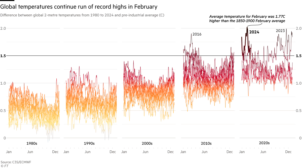This is a staggering amount of information to display, and there are some really smart design choices here. This is all detailed by Steven Bernard in the FT's series: "The Climate Graphic: Explained".Compare it with the chart Copernicus provided: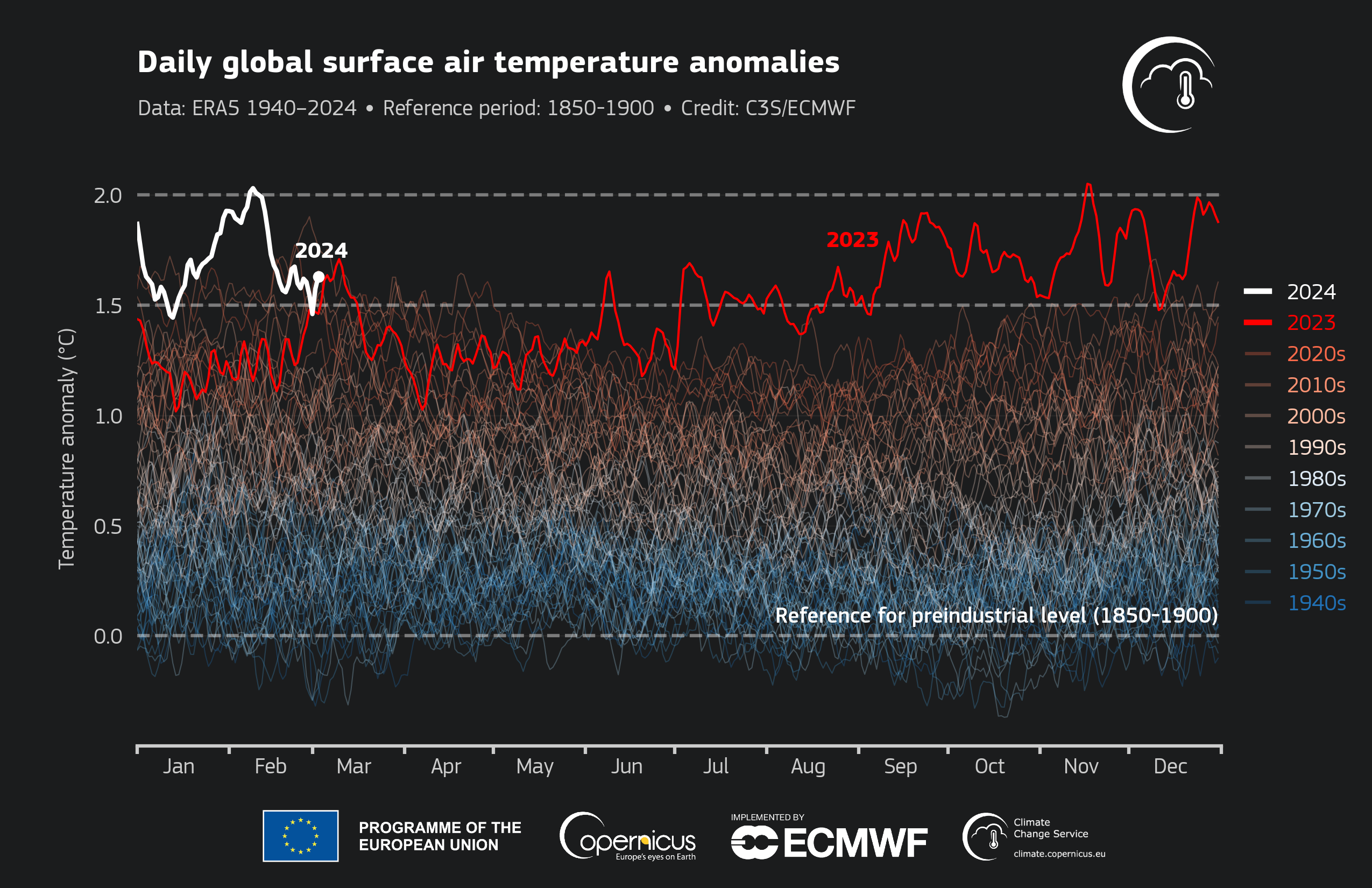{fig-align="center" width="551"}Or the BBC: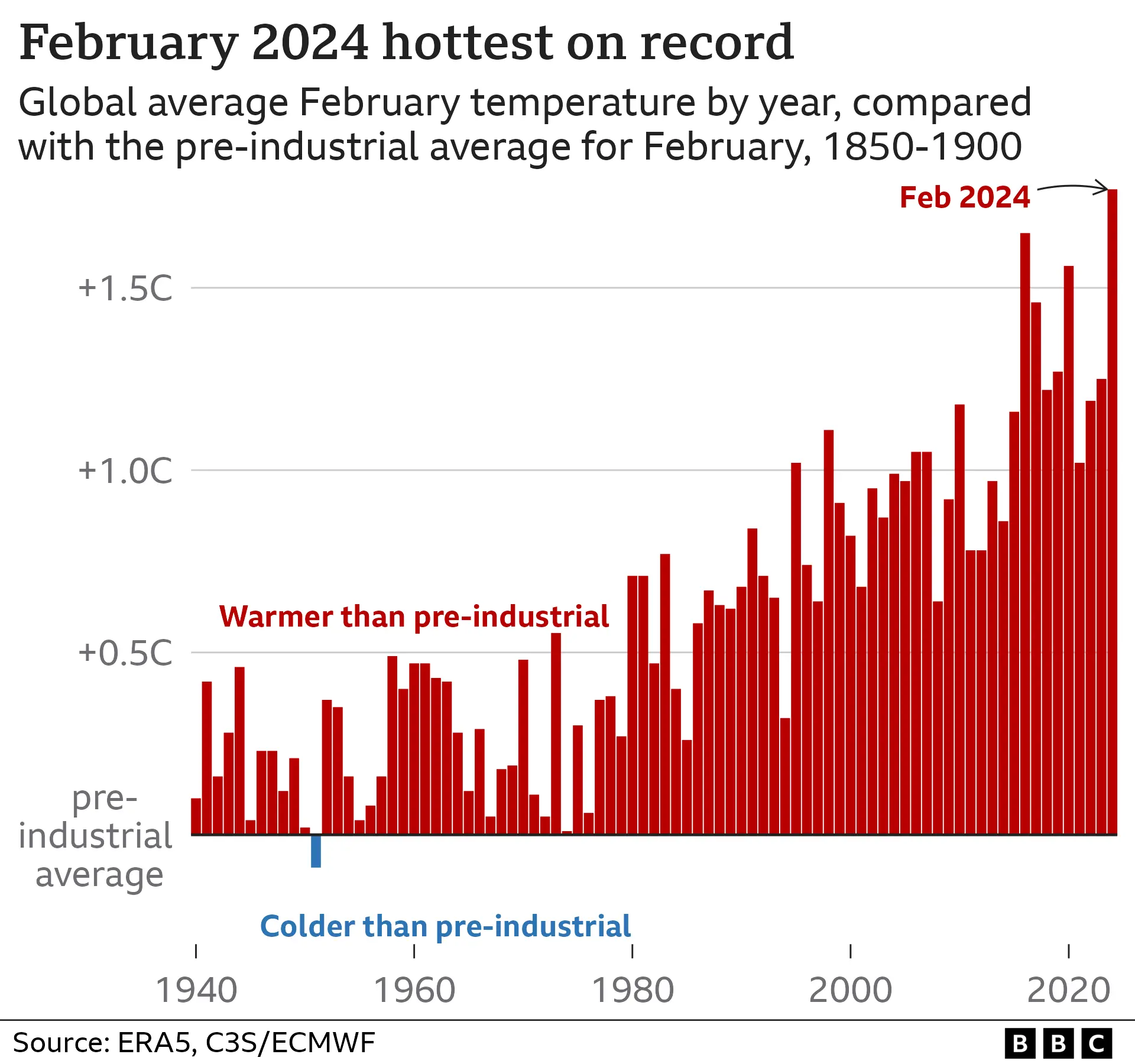{fig-align="center" width="534"}Both very clear. Even so, the balance of clarity and detail in Bernard's chart helps make sense of the terrifying spaghetti in a quite unique way:> Splitting the data across five decadal charts makes the increase in temperatures over the period more apparent. Previously this pattern would have been harder to see within the tangle of 55 lines.>> Reinforcing the temperature trend is the colour gradient: this is a technique called 'double encoding' --- the *colour* of the lines reflects the same information as the *position* of the line on the chart.>> Steven Bernard, The Climate Graphic: Explained, 10/03/2024Before we get too carried away with appearance, the reality behind this chart is terrifying:> What we face is planetary instability and disruption of everyday life as burning carbon loads the climate dice so that it throws six after six. [Mark Blyth](https://www.theguardian.com/commentisfree/2021/aug/11/no-getting-back-to-normal-climate-breakdown-ipcc-report) calls it "a giant non-linear outcome generator with wicked convexities. In plain English, there is no mean, there is no average, there is no return to normal. It's one-way traffic into the unknown." The earth system is an "angry beast" that we are poking with the carbon stock stick.>> Kate Mackenzie & Tim Sahay, [Global Boiling (2023)](https://www.phenomenalworld.org/analysis/global-boiling/)Or from Malm's recent piece "The Destruction of Palestine Is the Destruction of the Earth":> To take but one example, the Amazon is caught up in a spiral of dieback that might end with it becoming a treeless savanna. The Amazon rainforest has been standing for 65 million years. Now, in the span of a few short decades, global warming -- together with deforestation, the original form of ecological destruction -- is pushing the Amazon towards the tipping point beyond which it would cease to exist. Indeed, as I write, much recent research suggests that it is perched on that point.[^3] If the Amazon were to lose its forest cover -- a dizzying thought, but entirely within the realm of a possible near future -- it would be a different kind of Nakba. The immediate victims would, of course, be the indigenous and afrodescendent and other people of the Amazon, some 40 million in all, who would, in the most likely scenario, see fires rip through their forest and turn it into smoke and so live through the end of a world.>> Andreas Malm, [The Destruction of Palestine Is the Destruction of the Earth](https://www.versobooks.com/blogs/news/the-destruction-of-palestine-is-the-destruction-of-the-earth#_edn2)[^3]: Malm cites the following in a footnote: " E.g. Thomas E. Lovejoy & Carlos Nobre, 'Amazon Tipping Point: Last Chance for Action', *Science Advances* (2019) 5: 1--2; Chris A. Boulton, Timothy M. Lenton & Niklas Boers, 'Pronounced Loss of Amazon Rainforest Resilience since the Early 2000s', *Nature Climate Change* (2022) 12: 271--8; James S. Albert, Ana C. Carnaval, Suzette G. A. Flantua et al., 'Human Impacts Outpace Natural Processes in the Amazon', *Science* (2023) 379: 1--10; Meghie Rodrigues, 'The Amazon's Record-Setting Drought: How Bad Will It Be?', *Nature* (2023) 623: 675--6; and for further documentation and discussion, Wim Carton & Andreas Malm, *The Long Heat: Climate Politics When It's Too Late* (London: Verso, 2025)." At this stage it is absurd to claim that the main issue with climate change is a lack of knowledge or some epistemic hurdle. It is not that isn't known or it isn't understood. The obstacles we face are rooted in [power](https://www.phenomenalworld.org/analysis/militarized-adaptation/), [conflict](https://legrandcontinent-eu.translate.goog/fr/2022/03/18/la-naissance-de-lecologie-de-guerre/?_x_tr_sl=fr&_x_tr_tl=en&_x_tr_hl=en&_x_tr_pto=op,wapp), [coalition building](https://www.phenomenalworld.org/analysis/liberal-blindspots/), and [strategy](https://www.phenomenalworld.org/interviews/governing-the-climate/).As Malm puts it:> The destruction of Palestine and the destruction of the Earth play out in broad daylight. There is a surfeit of documentation of both. Knowledge of the two processes and how they unfold in real time is superabundant: we know everything we need to know about the catastrophes, and yet the capitalist core keeps rushing fuel to the fireplaces and bombs to Gaza.>> Andreas Malm, [The Destruction of Palestine Is the Destruction of the Earth](https://www.versobooks.com/blogs/news/the-destruction-of-palestine-is-the-destruction-of-the-earth#_edn2)That one might spend their time on [social epistemology](https://plato.stanford.edu/entries/epistemology-social/) and data visualisation seems silly (cough). I do think these fields [have more work to do](https://www.theguardian.com/artanddesign/2019/aug/27/pictures-unite-graphic-design-vision-marie-otto-neurath) and [much to offer](https://plato.stanford.edu/entries/neurath/visual-education.html)...but of course I would. Put bluntly:{fig-align="center" width="253"}So it goes. Something for me to reflect on. For now I'll just make some charts...## The dataFirst, we can [grab the data from Copernicus' surface air temperature anomalies data set.](https://sites.ecmwf.int/data/c3sci/bulletin/202402/press_release/) Its almost in the shape we need it. Just need to do a bit of filtering and tidying up. You can click the code button to see that.```{r}library(readr)library(tidyverse)og_data <-read_csv("march6_PR_fig3_timeseries_era5_2t_daily_anomalies_relative_to_preindustrial_1940-2024.csv", skip =14) # this is not the data covering all of March. Can't find that yet?# Minor cleaningclean_data <- og_data %>%filter(!status =="PRELIMINARY") %>%# remove one observationselect(date, ano_pi) %>%mutate(date =as_date(date)) %>%filter(date >="1980-01-01") %>%# To remake Bernard's chartmutate(year =year(date),decade =as.character((year %/%10) *10) ) %>%select(date, year, decade, ano_pi) # Transform the date to have the same year (e.g., a dummy year) for plotting# This will make it easier for us to overlay the spaghetti at the same point on the x axisclean_data <- clean_data %>%mutate(dummy_date =make_date(2000, month(date), day(date))) %>%filter(!is.na(dummy_date)) # Ensure no NA dates after transformation# export datawrite.csv(clean_data, "clean_data.csv", row.names=FALSE)# take a lookglimpse(clean_data)```One thing I'm unsure about is getting the daily temperature data to cover all of March. I had a look at the Copernicus April press release, but they only have daily data for sea surface temperature. If I find it, I'll update.Next I'll do some rough sketches of Bernard's faceted spaghetti chart with ggplot2, Observable Plot, and D3. These are sketches, not faithful reproductions of that FT chart. The idea here is to compare approaches and try things out.## ggplot214 brief lines of ggplot2 code gives us something pretty close. You can click the code button to see:```{r}#| fig.height=3,ggplot(clean_data, aes(x = dummy_date, y = ano_pi, group = year, color = ano_pi)) +geom_line(alpha =0.5) +scale_x_date(date_labels ="%b",breaks =as.Date(c("2000-01-01", "2000-06-01", "2000-12-01")), labels =c("Jan", "Jun", "Dec")) +theme_minimal() +scale_color_viridis_c(option ="plasma", direction=-1) +xlab(NULL) +ylab(NULL) +facet_wrap(~decade, nrow =1) +theme(legend.position ="none",panel.grid.minor =element_blank(),panel.grid.major.x =element_blank(),axis.ticks.x =element_line(color ="black"))```I'm sure there's a colour scheme that matches more closely, but I haven't looked/implemented a custom one.## Observable PlotObservable plot can sometimes be a little more verbose. But I've also broken things up in a way that makes the code clearer (but a little longer).:```{r}#| echo: falseojs_define(data_ojs = clean_data)``````{ojs}//| echo: falsePlot = import("https://esm.sh/@observablehq/plot@0.6.1"); // 0.6.1 beforeparseTime = d3.utcParse("%Y-%m-%d");dataOjs = transpose(data_ojs)dataEdit = dataOjs // have to define this otherwise it throws an error .forEach((d) => { d.dummy_date = parseTime(d.dummy_date);});``````{ojs}xAxis = ({ tickFormat: "%b", ticks: [new Date("2000-01-01"), new Date("2000-06-01"), new Date("2000-12-01")], label: null})yAxis = ({ grid: true, nice: true, tickSize: 0, label: null, labelArrow: "none"})facetStyle = ({ label: null, padding: 0.2, })lines = [ Plot.lineY( dataOjs, { fx: "decade", x: "dummy_date", y: "ano_pi", z: "year", stroke: "ano_pi", order: "year", strokeWidth: 0.5 }) ]Plot.plot({ height: 300, marginTop: 25, marginBottom: 40, fx: facetStyle, color: {legend: false,scheme: "YlOrRd"}, x: xAxis, y: yAxis, marks: [ lines ].flat()})```The defaults are great, and the YlOrRd colour scheme gets us close.## D3Now lets move to a lower level library...D3. This gets very verbose very quick:```{ojs}data = FileAttachment("clean_data.csv").csv({ typed: true }){ const margin = { top: 20, right: 40, bottom: 30, left: 25 }, totalWidth = 960, // Total SVG width, adjust as needed height = 300 - margin.top - margin.bottom, dataByDecade = d3.group(data, (d) => d.decade); // Calculate width for individual facets based on the number of decades const facetWidth = (totalWidth - margin.left - margin.right) / dataByDecade.size; // Create the SVG container const svg = d3 .create("svg") .attr("viewBox", `0 0 ${totalWidth} ${height + margin.top + margin.bottom}`) .attr("style", "max-width: 100%; height: auto; font: 10px sans-serif;"); // Shared scales and axes setup might need adjustments // Y Scale - this can be shared or individual per facet depending on your data const y = d3 .scaleLinear() .domain([0, d3.max(data, (d) => d.ano_pi)]) .range([height, 0]); const x = d3 .scaleTime() .domain(d3.extent(data, (d) => d.dummy_date)) .range([0, facetWidth - margin.right]); const lineGenerator = d3 .line() .x((d) => x(d.dummy_date)) // Initially set to use x scale .y((d) => y(d.ano_pi)); // Color scale for lines const color = d3 .scaleSequential(d3.interpolateYlOrRd) .domain([0, d3.max(data, (d) => d.ano_pi)]); const minAnoPi = d3.min(data, (d) => d.ano_pi); const maxAnoPi = d3.max(data, (d) => d.ano_pi); let xOffset = margin.left; // Offset for positioning facets horizontally dataByDecade.forEach((values, decade) => { // X Scale - specific for this facet const x = d3 .scaleTime() .domain(d3.extent(values, (d) => d.dummy_date)) .range([0, facetWidth - margin.right]); const facetGroup = svg .append("g") .attr("transform", `translate(${xOffset}, ${margin.top})`); // Increment xOffset for the next facet xOffset += facetWidth; // Define and draw X Axis const xAxis = d3 .axisBottom(x) .tickFormat(d3.timeFormat("%b")) .tickValues([ new Date("2000-01-01"), new Date("2000-06-01"), new Date("2000-12-01") ]); facetGroup .append("g") .attr("transform", `translate(0, ${height})`) .call(xAxis); // Draw Y Axis const yAxis = d3.axisLeft(y); facetGroup.append("g").call(yAxis); // Define the line generator const line = d3 .line() .x((d) => x(d.dummy_date)) .y((d) => y(d.ano_pi)); // Set gradient const gradient = svg .append("linearGradient") .attr("id", "line-gradient-3") .attr("gradientUnits", "userSpaceOnUse") .attr("x1", 0) .attr("y1", y(minAnoPi)) .attr("x2", 0) .attr("y2", y(maxAnoPi)) .selectAll("stop") .data([ { offset: "5%", color: "#CCCCCC" }, { offset: "15%", color: "#FFC300" }, { offset: "40%", color: "#FF5733" }, { offset: "70%", color: "#C70039" }, { offset: "90%", color: "#900C3F" }, { offset: "98%", color: "#581845" } ]) .enter() .append("stop") .attr("offset", function (d) { return d.offset; }) .attr("stop-color", function (d) { return d.color; }); const dataByYearWithinDecade = d3.group(values, (d) => d.year); dataByYearWithinDecade.forEach((yearValues, year) => { // For each year within the decade, create a separate line facetGroup .selectAll(`.line-${year}`) .data([yearValues]) .join("path") .attr("class", `line line-${year}`) .attr("fill", "none") .attr("stroke", "url(#line-gradient-3)") .attr("d", lineGenerator); }); }); return svg.node();}```## D3 [One More Time](https://www.youtube.com/watch?v=FGBhQbmPwH8)Ok so like...the D3 version is super verbose. And that raises questions. Why use it? Why not just go for the quick options like ggplot2 or Observable Plot? They get you pretty far.Well...with D3...you can basically make and edit whatever you want...and we're just a few more lines of code away from making fancy interactive stuff like the chart at the start of this post.Have a click on the interactive chart below and check out the code. You can decide whether this was a good idea or not:```{ojs}// Yes I should comment and tidy this code up{ const margin = { top: 30, right: 40, bottom: 30, left: 25 }; const totalWidth = 960; const height = 350 - margin.top - margin.bottom; const dataByDecade = d3.group(data, (d) => d.decade); const dur = 1400; // label const data2023 = data.filter((d) => d.year === 2023); const lastData2023 = data2023[data2023.length - 1]; const data2024 = data.filter((d) => d.year === 2024); const lastData2024 = data2024[data2024.length - 1]; const svg = d3 .create("svg") .attr("viewBox", `0 0 ${totalWidth} ${height + margin.top + margin.bottom}`) .attr("style", "max-width: 100%; height: auto; font: 10px sans-serif;"); let facetWidth = (totalWidth - margin.left - margin.right) / dataByDecade.size; const y = d3 .scaleLinear() .domain([0, d3.max(data, (d) => d.ano_pi)]) .range([height, 0]); const minAnoPi = d3.min(data, (d) => d.ano_pi); const maxAnoPi = d3.max(data, (d) => d.ano_pi); const x = d3 .scaleTime() .domain(d3.extent(data, (d) => d.dummy_date)) .range([0, facetWidth - margin.right]); const xSuperimposed = d3 .scaleTime() .domain(d3.extent(data, (d) => d.dummy_date)) .range([0, totalWidth - margin.left - margin.right]); const lineGenerator = d3 .line() .x((d) => x(d.dummy_date)) // Initially set to use the 'x' scale .y((d) => y(d.ano_pi)); let isMerged = false; function updateFacets() { facetWidth = isMerged ? totalWidth - margin.left - margin.right : (totalWidth - margin.left - margin.right) / dataByDecade.size; const currentXScale = isMerged ? xSuperimposed : x; lineGenerator.x((d) => currentXScale(d.dummy_date)); svg .selectAll(".facet") .transition() .duration(dur) .attr("transform", (_, i) => isMerged ? `translate(${margin.left}, ${margin.top})` : `translate(${margin.left + i * facetWidth}, ${margin.top})` ); svg .selectAll(".decade-label") .transition() .duration(dur) .style("opacity", isMerged ? 0 : 1); // Hide labels when merged svg .selectAll(".twentythree-label") .transition() .duration(dur) .attr("x", currentXScale(lastData2023.dummy_date)) // Use currentXScale for positioning .attr("y", y(lastData2023.ano_pi)); svg .selectAll(".twentyfour-label") .transition() .duration(dur) .attr("x", currentXScale(lastData2024.dummy_date)) // Use currentXScale for positioning .attr("y", y(lastData2024.ano_pi)); // Hide or show y-axis gridlines based on isMerged svg .selectAll(".facet .tick line") .transition() .duration(dur) .style("opacity", isMerged ? 0 : 1); svg .selectAll(".x-axis") .transition() .duration(dur) .call( d3 .axisBottom(currentXScale) .tickFormat(d3.timeFormat("%B")) .tickValues([ new Date("2000-01-01"), new Date("2000-06-01"), new Date("2000-12-01") ]) ) .call((g) => g.select(".domain").attr("stroke", "none")) //.remove()) .call((g) => g.selectAll(".tick line").attr("stroke", "#777")); svg .selectAll(".line") .transition() .duration(dur) .attr("d", (d) => lineGenerator(d)); // Debugging console.log("Facet Width:", facetWidth); // remember to switch to click instead of loop? console.log("Is Merged:", isMerged); }// comment this out if switching to loop svg.on("click", function () { isMerged = !isMerged; updateFacets(); });// uncomment to switch to loop //setInterval(() => { //isMerged = !isMerged; // Toggle the state //updateFacets(); // Update the facets according to the new state //}, 3000); dataByDecade.forEach((values, decade, i) => { const xOffset = margin.left + i * facetWidth; const facetGroup = svg .append("g") .attr("class", "facet") .attr("transform", `translate(${xOffset}, ${margin.top})`); facetGroup .append("text") .attr("class", "decade-label") .attr("x", facetWidth / 2) // Center the label .attr("y", 0 - margin.top / 2) // Adjust y position .text(decade + "s") .style("font-size", "16px") // Adjust font size .attr("text-anchor", "middle"); facetGroup .append("g") .attr("class", "x-axis") .attr("transform", `translate(0, ${height})`) .call( d3 .axisBottom(x) .tickFormat(d3.timeFormat("%b")) .tickValues([ new Date("2000-01-01"), new Date("2000-06-01"), new Date("2000-12-01") ]) ) .call((g) => g.select(".domain").remove()) .call((g) => g.selectAll(".tick line").attr("stroke", "#777")); facetGroup .append("g") .call(d3.axisLeft(y).tickValues([0, 0.5, 1, 1.5, 2])) .call((g) => g.select(".domain").remove()) .call((g) => g.selectAll(".tick line").attr("stroke", "#777")) .call((g) => g .selectAll("line") .attr("x2", facetWidth - margin.right) .attr("stroke", "#ddd") ); const line = d3 .line() .x((d) => x(d.dummy_date)) .y((d) => y(d.ano_pi)); // Set gradient const gradient = svg .append("linearGradient") .attr("id", "line-gradient-1") .attr("gradientUnits", "userSpaceOnUse") .attr("x1", 0) .attr("y1", y(minAnoPi)) .attr("x2", 0) .attr("y2", y(maxAnoPi)) .selectAll("stop") .data([ { offset: "5%", color: "#CCCCCC" }, { offset: "15%", color: "#FFC300" }, { offset: "40%", color: "#FF5733" }, { offset: "70%", color: "#C70039" }, { offset: "90%", color: "#900C3F" }, { offset: "98%", color: "#581845" } ]) .enter() .append("stop") .attr("offset", function (d) { return d.offset; }) .attr("stop-color", function (d) { return d.color; }); const dataByYearWithinDecade = d3.group(values, (d) => d.year); dataByYearWithinDecade.forEach((yearValues, year) => { // For each year within the decade, create a separate line facetGroup .selectAll(`.line-${year}`) .data([yearValues]) .join("path") .attr("class", `line line-${year}`) .attr("fill", "none") .attr("stroke", "url(#line-gradient-1)") .attr("d", lineGenerator); }); // Check if facet includes year 2023 or 2024, and redraw those lines if (decade === 2020) { const highlightYears = [2024]; // Define which years to highlight highlightYears.forEach((year) => { const yearData = data.filter((d) => d.year === year); if (yearData.length > 0) { // Draw the wider white line (to emphasise 2024) facetGroup .selectAll(`.line-outline-${year}`) .data([yearData]) .join("path") .attr("class", `line line-outline-${year}`) .attr("fill", "none") .attr("stroke", "white") // White outline .attr("stroke-width", 6) // Make this line wider than the colored line .attr("d", lineGenerator); facetGroup .selectAll(`.line-highlight-${year}`) .data([yearData]) .join("path") .attr("class", `line line-highlight-${year}`) .attr("fill", "none") .attr("stroke", "url(#line-gradient-1)") .attr("stroke-width", 3.5) // Make the line wider // Optional: Adding a stroke shadow effect for more prominence //.style("filter", "url(#drop-shadow)") .attr("d", lineGenerator); } }); } if (decade === 2020) { // Adjust this condition based on how your decade value is formatted // Assuming peakData2023 has been calculated correctly before this forEach facetGroup .append("text") .attr("class", "twentythree-label") .attr("x", x(lastData2023.dummy_date)) // Position at the last data point's date .attr("y", y(lastData2023.ano_pi)) // Position at the last data point's value .attr("dy", "0px") .attr("dx", "5px") .attr("text-anchor", "start") .style("font-size", "16px") .style("fill", "black") .style("font-weight", "bold") .text("2023"); // } // if (decade === 2020) { facetGroup .append("text") .attr("class", "twentyfour-label") .attr("x", x(lastData2024.dummy_date)) // Position at the last data point's date .attr("y", y(lastData2024.ano_pi)) // Position at the last data point's value .attr("dy", "0px") .attr("dx", "5px") .attr("text-anchor", "start") .style("font-size", "16px") .style("fill", "black") .style("font-weight", "bold") .style( "text-shadow", "-1px -1px 0 #fff, 1px -1px 0 #fff, -1px 1px 0 #fff, 1px 1px 0 #fff" ) .text("2024"); } }); updateFacets(); return svg.node();}```If you'd like to experiment with or improve the chart from the beginning of this blog, I've thrown it into an [Observable notebook](https://observablehq.com/@yusuf-imaad-khan). A [judicious use of LLMs](https://simonwillison.net/2024/Mar/22/claude-and-chatgpt-case-study/) can be handy too, but sometimes you just have to put them away and debug for yourself.::: {style="font-size: 42px; text-align: center; color: #5a6570; font-family: 'Source Serif Pro';"}*Fin*:::


