Last week LSE UCU published a report called “The Crisis of Academic Casualisation at LSE”. I would recommend taking a look. They summarise their main findings in a twitter thread too. It is a damning indictment of LSE and its purported aims as a so called higher education institution. Take a look at one of the highlights:
In truth, it makes you ashamed to be associated with such a racket. LSE have created precarity for staff. LSE increase the intake of domestic and international students and gladly take their money. LSE MSc courses are ridiculously priced and sometimes very similar courses have massive price differentials solely due to names. LSE have money to spend on buildings named after benefactors but they can’t help build the careers of fixed-term staff. Don’t get me started on the fact that they named a building after Paul Marshall (yes the GB news investor and leave campaign funder). Recently, LSE unilaterally disaffiliated from Stonewall without any prior consultation or decent explanation to students and staff. LSE (like many universities) is an institution that serves power and pays lip service to the interests of staff and students. There is much more to say here1 but I’ll move on to the topic at hand.
In response to LSE UCU’s casualisation report I saw a few people saying they’d like to see similar analysis for their institution. LSE UCU also encouraged others to make use of their code to conduct similar analysis. So I thought why not try and do similar analysis for every institution? It could be useful and I like a challenge.
I’d like to stress that all of what follows builds on analysis from Marion Lieutaud (2023) and LSE UCU members. Lieutaud drew on HESA (Higher Education Statistics Authority) data for much the analysis. The heavy of lifting of getting the data in a good format was basically already done by Lieutaud. All I’ve done is taken that data and shoved it in some charts so you can (hopefully) see every institution.
Caveats
It is tricky enough to do this sort of thing for one institution. I have no doubt that the data quality and caveats vary across institutions. Before proceeding I wanted to caveat a few things:
I could have made a mistake - either in my replication of the analysis or the charts I’ve made below. You can take a look at my code here, for this blog post here, or you can click the button on the top right of this page to view code.
Data available from HESA starts at 2014/15
I cannot replicate all analysis of the original report because some of it uses non HESA data (e.g. LSE internal surveys and HR data)
Some universities have missing data and in some instances there are good explanations for this (e.g. the recent founding of the New College of Humanities). I have not interpolated missing observations
I have noticed some issues with the HESA data (e.g. SOAS being called something different one year) and have fixed where I’ve spotted. There are some I haven’t fixed yet e.g. City University and St. Andrews have slightly different names. I’ll see if I can fix these at some point2. There could likely be more errors but hey verification and validation should be one of the tasks of…the Higher Education Statistics Authority no? Not a random grad student…
I am a wally and didn’t use UKPRN codes to match institutions. Apologies. Rookie mistake on my part.
Where possible I have replicated Lieutaud’s excellent charts but just added a dropdown so you can compare other HEIs. This also allowed me to eyeball whether I’d messed any of the analysis up compared to the original report.
I’ve added a dashed line for the mean of the Russell Group. A group of 24 universities that take a large share of funding, grant a majority of PhDs, and are all about research eXceLleNcE
When I’ve omitted a comparator university on the chart that appeared in the report, its because of visibility and I couldn’t get the blasted label out of the way in Observable. This was a pragmatic choice. Sorry.
The Russell Group or the hustle group?
So lets take a look at all the data Lieutaud put together. Specifically, what is the distribution of fixed term contracts like across all institutions since 2014-15? And how does the Russell Group3 look? Well it looks like this:
The Russell Group tend to have a higher proportion of staff on fixed term contracts
% of staff that are fixed term - broken down by year and institution. Hover to see institution names.
import {Plot} from"@mkfreeman/plot-tooltip";boxdata =transpose(boxdata_chart_convert);Plot.plot({height:700,//6 or 700?marginBottom:60,x: {label:"% of Staff that are Fixed-Term→",//domain: [0, 100],grid:true,nice:true,ticks:5,labelOffset:55 },y: {label:null,grid:true },facet: {data: boxdata,y:"date",marginLeft:175},fy: {label:null},marks: [ Plot.boxX(boxdata, {x:"prop_casual",fillOpacity:0.4}), Plot.dot(boxdata, Plot.dodgeY({x:"prop_casual",fill:"rg_boxplot_flag",anchor:"middle",r:3.5,//7fillOpacity:0.8,padding:0.5,title: (d) =>`${d.HE_provider_short}\n Score: ${d.prop_casual}` })) ],color: {legend:false,range: ["#adb5bd","#de425b"],ordinal:true,style: {fontSize:"1em" } },})
For visibility, excludes institutions reporting 0. These tend to be smaller specialised institutions. Excluded large outlier Court Theatre Training Company Ltd which reported 100% in last few years. Source: M. Lieutaud (2023) LSE UCU Analysis of HESA data Graphic: Yusuf Imaad Khan / @yusuf_i_k Rogue Analysis📈
Whilst the median isn’t shifting much every year, you can spot some patterns. Russell Group universities tend to have a higher proportion of staff on fixed term contracts. They are leading universities…for casualisation. Big L for the Russell Group and its stated aim to (*checks google):
help ensure that our universities have the optimum conditions in which to flourish and continue to make social, economic and cultural impacts through their world-leading research and teaching.
You can hover over the dots above to see institution names.
Number of permanent and fixed-term academic staff
Now lets actually move on to replicating stuff from the report in an interactive way. Try out the dropdown below and see what fixed-term and permanent staff trends look like at your institution (I am sorry I couldn’t make the cool animated chart that Lieutaud made).
Number of fixed term and permanent academic staff at:
viewof HE = Inputs.select(he_names_convert.HE_provider_short, {value:"LSE"})
Proportion of casual (fixed-term) staff amongst academic staff
Next lets take a look at the proportion of fixed-term staff amongst academic staff. I am curious as to whats happening in UCL and Glasgow. I did hear something about the way UCL classify permanent jobs being shady (I linked a tweet in the caveats above). But I’m not really sure. Do shout if you know! Also worth noting that the Russell Group average is somewhat flat and Oxford’s proportion of fixed-term staff is mad. I think only the Open University is ahead (but there was some big progress last year).
Remember to use the dropdown to check out other places.
Proportion (%) of fixed term staff among academic staff at:
Relative changes in share of permanent academic staff numbers since 2014-2015
Ok this is a slightly different chart to the one that is in the report. The report had “relative changes in the number of permanent academic staff since 2014-15”. I’ve done “changes in the share of permanent academic staff”. This makes % changes relative to the share of permanent academic staff, and brings out trends in staff composition a bit more. Shout out to Peter Wyckoff for suggesting!
Once again, do use the dropdown to check out other places!
Proportionate changes (%) in share of permanent academic staff at:
Student-to-staff ratio (permanent academic staff only) since 2014-2015
This is the student to permanent staff ratio (I’m going to be a bit light on the write-up for the rest of this post because I want to get this out and I have some other work to do - apologies).
Relative changes in student numbers since 2014-2015
Next we have relative changes in student numbers. My main gripe with all this data is how it doesn’t go back before 2014-15. There is more to be understood here. But anyway, we know many places like LSE are increasing student numbers, have high levels of international students, charge them mad fees, and then this doesn’t translate into solid contracts and good working conditions? Outstanding move to exploit students and staff at the same time.
Proportionate changes (%) in number of students at:
Proportion of international students among all enrolled students, over time since 2014-2015
Finally here is the proportion of international students across universities. Please try out at least one of the dropdowns. I tried quite hard to make them all work and it would make me happy.
So I rushed a bit to get this out. I might go back and redraft this post when I have more time. But I hope that was useful. A key takeaway here is that the share and trend of casualisation differs across institutions but is somewhat concentrated in the Russell Group/larger unis/larger cities (okay yes that is not very shocking). I wasn’t able to do a proper dig into the data, but I’d encourage you to take a look yourself and think about the trends. I am sure there is so much more analysis to be done.
Please let me know if you spot any issues or have any suggestions. Given the work I have to do, I can’t promise I’ll get to it. But we’ll see! Once again, do check out the LSE UCU report on casualisation. You can also take a look at my code here, for this blog post here, or you can click the button on the top right of this page to view code. I’ve also saved the cleaned up dataset as a csv in this folder on github.
I should probably close with some words of support for the union and strikes, but I hope the work above conveys my support.
Solidarity forever.
Annex: An attempt to view pressures across the sector
I added this extra chart on 10/04/2023. It is a bit dense, but I was attempting to view pressures across the sector by looking at:
The student to permanent staff ratio (x axis)
% of fixed-term staff (y axis)
Total number of students (size of ◯ )
Broken down by Russell Group/wider sector
Disaggregated for institution (individual ◯ )
All between 2014/15 - 2021/22. It would be great if we could go back a few more years to see the proper effect of lifting the student number cap.
I thought this chart might help explore and explain where the pressures lie in the sector. A movement to the northeast would suggest increased pressure in the sector as the student to permanent staff ratio increases (X) and more fixed-term staff are brought in (Y).
Whilst its dense, lets focus on the Russell Group for a second. The boom in student numbers (size of ◯ ) is accompanied by increases in the student to permanent staff ratio. But there is a much more dramatic pivot to fixed-term staff - especially for LSE, KCL, and QMUL.
Next, lets focus on the wider sector. Student numbers have also boomed. The % of staff that are fixed-term has also increased, but what is more dramatic is the increase in the student to permanent staff ratio.
So the Russell Group can respond to the crisis of higher education by pumping up fixed term contracts (especially if domestic and international student numbers have increased), but the wider sector faces greater pressure from student numbers on permanent staff.
So my rough interpretation is something like, Russell Group use improved financial position, “prestige” attraction, and cash flow from booming student numbers (domestic but especially international) to keep pressures at bay. But the rest of the sector can do this to a lesser extent and feels the direct pressure of increased student numbers hitting the student to permanent staff ratio.
Let me know if you disagree and what you reckon! Maybe this chart was just too dense.
Student numbers have boomed compared to staffing capacity
Hover to check institution. ◯ size = Total number of students
mydata_hr =transpose(hr_chart_convert).filter(d => d.year== year_slider);// plotchart = Plot.plot({marginTop:30,marginRight:160,marginBottom:65,height:500,x: {label:"Student to Permanent Staff Ratio →",nice:true,domain: [0,50],grid:true,tickPadding:10 },y: {className:"axis-lab",label:"↑ % of Staff that are Fixed-Term",domain: [0,90],grid:true,nice:true,ticks:5,tickPadding:10 },facet: {data: mydata_hr,y:"rg_flag",marginBottom:10},fy: {label:null},marks: [ Plot.dot(mydata_hr,{x:"staffstudent_ratio",y:"prop_casual",r:"total",stroke:"rg_flag",strokeWidth:1,title: (d) =>`${d.he_provider}\n X - Student to permanent staff ratio: ${d.staffstudent_ratio}\n Y - % of casual: ${d.prop_casual}\n Z/Size - Total students: ${d.total}`,fill:"rg_flag",fillOpacity:0.3 }), Plot.arrow(mydata_hr, {x1:30,y1:40,x2:40,y2:60,bend:false,stroke:3,fy: ["Russell Group"] }), Plot.text(mydata_hr, Plot.selectFirst({textAnchor:"start",x: (d) =>35,y: (d) =>68,text: [`More pressure`],fy: ["Russell Group"],fontSize:24, }) ) ],color: {legend:false,range: ["#de425b","#446e9b"] }})
Excludes student staff ratios > 50 for visibility. This exclusion catches the Open University and also smaller specialised institutions. Source: M. Lieutaud (2023) LSE UCU Analysis of HESA data Year formatting: 2021-2022 = 2022 Prompted by a suggestion from Bernard Keenan @psychicyogamat Graphic: Yusuf Imaad Khan / @yusuf_i_k Rogue Analysis📈
Footnotes
At this point you might ask “why do you even go there if its so bad?”. Fair but a post for another time.↩︎
I fixed these issues on 11/04/2023 for City , St. Andrews, Queen’s Belfast, and Newcastle. There may still be others?↩︎
Why the Russell Group? Its a group of universities in the UK that command a majority of research funding, grant the majority of PhDs, and are lauded for research excellence. Seems to make sense to pick them out and analyse trends.↩︎
Source Code
---title: "Academic casualisation across the UK"author: "Yusuf Imaad Khan"date: "2023-04-06"categories: [LSE, Unions, Strikes, Employment, Politics, Economics]editor: visualself-contained: truetoc: truetoc-depth: 2code-tools: true---Last week LSE UCU published a report called ["The Crisis of Academic Casualisation at LSE"](https://lseucu.com/wp-content/uploads/2023/03/The-Crisis-of-Academic-Casualisation-at-LSE_-2023-LSE-UCU-Report.pdf). I would recommend taking a look. They summarise their main findings in a [twitter thread](https://twitter.com/LSE_UCU/status/1641027157630623746) too. It is a damning indictment of LSE and its purported aims as a so called higher education institution. Take a look at one of the highlights: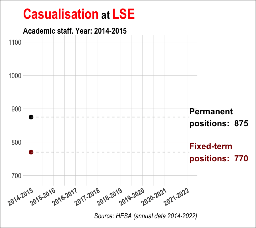{fig-align="center" width="60%" height="60%"}In truth, it makes you ashamed to be associated with such a racket. LSE have created precarity for staff. LSE increase the intake of domestic and international students and gladly take their money. LSE MSc courses are ridiculously priced and sometimes very similar courses have massive price differentials solely due to names. LSE have money to spend on buildings named after benefactors but they can't help build the careers of fixed-term staff. Don't get me started on the fact that they named a building after Paul Marshall (yes the GB news investor and leave campaign funder). Recently, [LSE unilaterally disaffiliated from Stonewall](https://thetab.com/uk/london/2023/01/19/students-deeply-disappointed-by-lse-cutting-ties-with-lgbtq-charity-stonewall-49231) without any prior consultation or decent explanation to students and staff. LSE (like many universities) is an institution that serves power and pays lip service to the interests of staff and students. There is much more to say here[^1] but I'll move on to the topic at hand.[^1]: At this point you might ask "why do you even go there if its so bad?". Fair but a post for another time.In response to LSE UCU's casualisation report I saw a few people saying **they'd like to see similar analysis for their institution**. LSE UCU also encouraged others to make use of their code to conduct similar analysis. So I thought why not try and do similar analysis for *every* institution? It could be useful and I like a challenge.I'd like to stress that all of what follows builds on [analysis from Marion Lieutaud (2023) and LSE UCU members](https://github.com/MarionLieutaud/LSEUCU-casualisation). Lieutaud drew on HESA (Higher Education Statistics Authority) data for much the analysis. The heavy of lifting of getting the data in a good format was basically already done by Lieutaud. All I've done is taken that data and shoved it in some charts so you can (hopefully) see *every institution*.::: {.callout-caution collapse="true"}## CaveatsIt is tricky enough to do this sort of thing for one institution. I have no doubt that the data quality and caveats vary across institutions. Before proceeding I wanted to caveat a few things:- I could have made a mistake - either in my replication of the analysis or the charts I've made below. You can take a look at my code [here](https://github.com/yusufimaadkhan/LSEUCU-casualisation-YIK), for this blog post [here](https://github.com/yusufimaadkhan/YK_Website/tree/master/posts), or you can click the button on the top right of this page to view code.- Data available from HESA starts at 2014/15- I cannot replicate all analysis of the original report because some of it uses non HESA data (e.g. LSE internal surveys and HR data)- Some universities have missing data and in *some* instances there are good explanations for this (e.g. the recent founding of the New College of Humanities). I have not interpolated missing observations- I have noticed some issues with the HESA data (e.g. SOAS being called something different one year) and have fixed where I've spotted. There are some I haven't fixed yet e.g. City University and St. Andrews have slightly different names. I'll see if I can fix these at some point[^2]. There could likely be more errors but hey verification and validation should be one of the tasks of...the Higher Education Statistics Authority no? Not a random grad student...- I am a wally and didn't use UKPRN codes to match institutions. Apologies. Rookie mistake on my part.- The structure and conditions of university contracts/funding may obscure the extent of casualisation e.g. [UCL classifying research posts as permanent but really they're open ended and dependent on future grant flows](https://twitter.com/PaulCinnam0n/status/1526505700901457923?s=20)- Where possible I have replicated Lieutaud's excellent charts but just added a dropdown so you can compare other HEIs. This also allowed me to eyeball whether I'd messed any of the analysis up compared to the original report.- I've added a dashed line for the mean of the Russell Group. A group of 24 universities that take a large share of funding, grant a majority of PhDs, and are all about research eXceLleNcE- When I've omitted a comparator university on the chart that appeared in the report, its because of visibility and I couldn't get the blasted label out of the way in Observable. This was a pragmatic choice. Sorry.:::[^2]: I fixed these issues on 11/04/2023 for City , St. Andrews, Queen's Belfast, and Newcastle. There may still be others?```{r}#| message: false#| warning: false#| echo: false# Notes:# % . change in share of perm academic staff - fig 3# Get rid of medians - take average russell group# Check time series - ok so this is a limitation of the HESA data. It just starts at 2015/15# Add a short summary of findings # Fix that SOAS name issue# Remember to make a joke about the russell/hustle grouplibrary(tidyverse)library(janitor)# First get the tidied datasetstaff_and_student_df <-read_csv("staff_and_student_df.csv") %>%rename(HE_provider = HE.provider) %>%# I'm in too deep and forgot to do clean names lmao# Fix issue where SOAS was called something else one year # names were different for all these in 2014/15. Fix them for the dropdown - with thanks to @EricBla68448839 for raising issuemutate(HE_provider =recode(HE_provider, "The School of Oriental and African Studies"="SOAS University of London", "The University of St Andrews"="The University of St. Andrews","The City University"="City, University of London","The Queen's University of Belfast"="Queen's University Belfast","University of Newcastle-upon-Tyne"="Newcastle University" )) %>%# Flag Russell Groupmutate(rg_flag =if_else(HE_provider %in%c("The University of Birmingham","The University of Bristol", "The University of Cambridge","Cardiff University","University of Durham", "The University of Edinburgh","The University of Exeter","The University of Glasgow","Imperial College of Science, Technology and Medicine","King's College London","The University of Leeds","The University of Liverpool","London School of Economics and Political Science","The University of Manchester","Newcastle University","University of Nottingham", "The University of Oxford", "Queen Mary University of London", "Queen's University Belfast","The University of Sheffield", "The University of Southampton", "University College London", "The University of Warwick", "The University of York"), 1, 0)) %>%#filter(rg_flag==1) %>% select(date,HE_provider) %>% distinct() # should have 24 Russell Group unis. 192 across all years. Check here.# Rename a fewmutate(HE_provider_short =case_match(HE_provider,"London School of Economics and Political Science"~"LSE","The University of Oxford"~"Oxford","The University of Cambridge"~"Cambridge","Imperial College of Science, Technology and Medicine"~"Imperial","University College London"~"UCL","The University of Edinburgh"~"Edinburgh","King's College London"~"KCL","The University of Warwick"~"Warwick","The University of Bristol"~"Bristol","The University of Glasgow"~"Glasgow",.default = HE_provider)) %>%# ok just get rid of "The university of blah" and "University of" for everywhere. Its really annoying to search through in the dropdowns and just sounds kind of pretentious?mutate(HE_provider_short =str_remove_all(HE_provider_short, "The University of |University of |The |the ")) # calc medians for every var and stitch onto dataset#Stats <- summarize_all(DF, median)#DFnew <- rbind(DF, Stats)# Get a df with just names of HEshe_names <- staff_and_student_df %>%select(HE_provider_short) %>%distinct() %>%arrange(HE_provider_short)# FIG 1# Casualisation numberscasual_numbers <- staff_and_student_df %>%select(1:5,HE_provider_short) %>%pivot_longer(cols =c(Open.ended.Permanent, Fixed.term),names_to ="contract.type") %>%mutate(contract.type =case_match(contract.type, "Fixed.term"~"fixed-term","Open.ended.Permanent"~"permanent"))# FIG 2prop_casual_chart <- staff_and_student_df %>%select(HE_provider, HE_provider_short, date, prop_casual, rg_flag) %>%mutate(bg=if_else(HE_provider%in%c("London School of Economics and Political Science","The University of Oxford",#"The University of Cambridge",#"Imperial College of Science, Technology and Medicine","University College London","The University of Edinburgh",#"King's College London","The University of Warwick",#"The University of Bristol","The University of Glasgow"),1,0)) %>%# create max and min for shading backgroundgroup_by(date,bg) %>%mutate(high =if_else(bg==1, max(prop_casual, na.rm=T),NA),low =if_else(bg==1, min(prop_casual, na.rm=T),NA)) %>%ungroup() %>%group_by(date,rg_flag) %>%mutate(rg_stat =if_else(rg_flag==1,mean(prop_casual, na.rm = T),NA),rg_lab ="Russell Group Average") %>%ungroup()# FIG 3# change this to prop permanent to see change in share of permanent - prop_permanent - used to be Open.ended Permanentprop_change_perm <- staff_and_student_df %>%select(HE_provider, HE_provider_short, date, prop_permanent, rg_flag) %>%mutate(bg=if_else(HE_provider%in%c("London School of Economics and Political Science","The University of Oxford","The University of Cambridge",#"Imperial College of Science, Technology and Medicine",#"University College London","The University of Edinburgh","King's College London",#"The University of Warwick","The University of Bristol","The University of Glasgow"),1,0)) %>%# create max and min for shading backgroundgroup_by(date,bg) %>%mutate(high =if_else(bg==1, max(prop_permanent, na.rm=T),NA),low =if_else(bg==1, min(prop_permanent, na.rm=T),NA)) %>%ungroup() %>%group_by(date,rg_flag) %>%mutate(rg_stat =if_else(rg_flag==1,mean(prop_permanent, na.rm = T),NA),rg_lab ="Russell Group Average") %>%ungroup()# FIG 4staff_student_chart <- staff_and_student_df %>%select(HE_provider, HE_provider_short, date, staffstudent_ratio, rg_flag) %>%mutate(bg=if_else(HE_provider%in%c("London School of Economics and Political Science","The University of Oxford","The University of Cambridge",#"Imperial College of Science, Technology and Medicine","University College London","The University of Edinburgh",#"King's College London","The University of Warwick","The University of Bristol","The University of Glasgow"),1,0))%>%# create max and min for shading backgroundgroup_by(date,bg) %>%mutate(high =if_else(bg==1, max(staffstudent_ratio, na.rm=T),NA),low =if_else(bg==1, min(staffstudent_ratio, na.rm=T),NA)) %>%ungroup() %>%group_by(date,rg_flag) %>%mutate(rg_stat =if_else(rg_flag==1,mean(staffstudent_ratio, na.rm = T),NA),rg_lab ="Russell Group Average") %>%ungroup()# FIG 5student_nb_chart <- staff_and_student_df %>%select(HE_provider, HE_provider_short, date, Total, rg_flag) %>%mutate(bg=if_else(HE_provider%in%c("London School of Economics and Political Science","The University of Oxford","The University of Cambridge","Imperial College of Science, Technology and Medicine","University College London",#"The University of Edinburgh",#"King's College London",#"The University of Warwick","The University of Bristol","The University of Glasgow"),1,0))%>%# create max and min for shading backgroundgroup_by(date,bg) %>%mutate(high =if_else(bg==1, max(Total, na.rm=T),NA),low =if_else(bg==1, min(Total, na.rm=T),NA)) %>%ungroup() %>%group_by(date,rg_flag) %>%mutate(rg_stat =if_else(rg_flag==1,mean(Total, na.rm = T),NA),rg_lab ="Russell Group Average") %>%ungroup()# FIG 6prop_non_uk_student_chart <- staff_and_student_df %>%select(HE_provider, HE_provider_short, date, prop_non_uk, rg_flag) %>%mutate(bg=if_else(HE_provider%in%c("London School of Economics and Political Science","The University of Oxford","The University of Cambridge",#"Imperial College of Science, Technology and Medicine","University College London","The University of Edinburgh",#"King's College London","The University of Warwick","The University of Bristol"#"The University of Glasgow" ),1,0))%>%# create max and min for shading backgroundgroup_by(date,bg) %>%mutate(high =if_else(bg==1, max(prop_non_uk, na.rm=T),NA),low =if_else(bg==1, min(prop_non_uk, na.rm=T),NA)) %>%ungroup() %>%group_by(date,rg_flag) %>%mutate(rg_stat =if_else(rg_flag==1,mean(prop_non_uk, na.rm = T),NA),rg_lab ="Russell Group Average") %>%ungroup()# Boxplot thingboxdata_chart <- prop_casual_chart %>%mutate(rg_boxplot_flag =if_else(rg_flag==1, "Yes", "No")) %>%select(1:4, rg_boxplot_flag) %>%filter(!HE_provider_short=="Court Theatre Training Company Ltd", # big outlier of 100% temo contracts - omitted for visibility. But if its real??? whats going on!prop_casual==0)# Ok one more chart attempt - hr = Hans Rosling hr_chart_data <- staff_and_student_df %>%clean_names() %>%# clean names this time smhfilter(!he_provider=="Total") %>%select(ukprn, he_provider, date, staffstudent_ratio, prop_casual, total) # this is total students hr_chart_data$year <-gsub("^[^-]*-", "", hr_chart_data$date)# split out the latter part of the date var and convert it to numeric so we can use the fun slider thing# Russell Group Flag hr_chart_data <- hr_chart_data %>%mutate(year =as.numeric(year),rg_flag =if_else(he_provider %in%c("The University of Birmingham","The University of Bristol", "The University of Cambridge","Cardiff University","University of Durham", "The University of Edinburgh","The University of Exeter","The University of Glasgow","Imperial College of Science, Technology and Medicine","King's College London","The University of Leeds","The University of Liverpool","London School of Economics and Political Science","The University of Manchester","Newcastle University","University of Nottingham", "The University of Oxford", "Queen Mary University of London", "Queen's University Belfast","The University of Sheffield", "The University of Southampton", "University College London", "The University of Warwick", "The University of York"), "Russell Group", "Wider Sector")) %>%filter(!he_provider =="Court Theatre Training Company Ltd",!staffstudent_ratio>50,!staffstudent_ratio==0,!prop_casual>90,!prop_casual==0)# Convert all the dataframes into observable arrays/DFs #(This is a weird command that won't run in a chunk but should work when you render the whole thing. Idk whats going on here. They might fix it in a future version)ojs_define(he_names_convert = he_names)ojs_define(data_casual_numbers_convert = casual_numbers)ojs_define(prop_casual_chart_convert = prop_casual_chart)ojs_define(prop_change_perm_convert= prop_change_perm)ojs_define(staff_student_chart_convert = staff_student_chart)ojs_define(student_nb_chart_convert = student_nb_chart)ojs_define(prop_non_uk_student_convert = prop_non_uk_student_chart)ojs_define(boxdata_chart_convert = boxdata_chart)ojs_define(hr_chart_convert = hr_chart_data)```## The Russell Group or the hustle group?So lets take a look at all the data Lieutaud put together. Specifically, what is the distribution of fixed term contracts like across all institutions since 2014-15? And how does the Russell Group[^3] look? Well it looks like this:[^3]: Why the Russell Group? Its a group of universities in the UK that command a majority of research funding, grant the majority of PhDs, and are lauded for research excellence. Seems to make sense to pick them out and analyse trends.{width="70" height="5"}::: {style="margin-top: -1.6rem;"}### The [Russell Group]{style="color: #de425b;"} tend to have a higher proportion of staff on fixed term contracts:::::: {style="color: #5a6570; margin-bottom: -0.5rem;font-size: 0.9em;"}\% of staff that are fixed term - broken down by year and institution. **Hover** to see institution names.:::```{ojs}//| warning: false//| echo: false//| message: falseimport {Plot} from "@mkfreeman/plot-tooltip";boxdata = transpose(boxdata_chart_convert);Plot.plot({ height: 700, //6 or 700? marginBottom: 60, x: { label: "% of Staff that are Fixed-Term→", //domain: [0, 100], grid: true, nice: true, ticks: 5, labelOffset: 55 }, y: { label: null, grid: true }, facet: {data: boxdata, y: "date", marginLeft: 175}, fy: {label: null}, marks: [ Plot.boxX(boxdata, {x: "prop_casual", fillOpacity: 0.4}), Plot.dot(boxdata, Plot.dodgeY({ x: "prop_casual", fill: "rg_boxplot_flag", anchor: "middle", r: 3.5, //7 fillOpacity: 0.8, padding: 0.5, title: (d) =>`${d.HE_provider_short} \n Score: ${d.prop_casual}` })) ], color: { legend: false, range: ["#adb5bd","#de425b"], ordinal: true, style: { fontSize: "1em" } },})```<axis-lab>```{=html}<style> text { font-size: 18px; color: #5a6570; } </style>```</axis-lab>::: {style="color: #5a6570; margin-top: -1rem;font-size: 0.7em;"}For visibility, excludes institutions reporting 0. These tend to be smaller specialised institutions.<br>Excluded large outlier Court Theatre Training Company Ltd which reported 100% in last few years.<br> Source: [M. Lieutaud (2023) LSE UCU Analysis of HESA data](https://github.com/MarionLieutaud/LSEUCU-casualisation) <br> Graphic: Yusuf Imaad Khan / @yusuf_i_k <br> Rogue Analysis📈:::Whilst the median isn't shifting much every year, you can spot some patterns. Russell Group universities tend to have a higher proportion of staff on fixed term contracts. They are leading universities...for casualisation. Big L for the Russell Group and its [stated aim](https://russellgroup.ac.uk/about/) to (\*checks google):> help ensure that our universities have the optimum conditions in which to flourish and continue to make social, economic and cultural impacts through their world-leading research and teaching.You can hover over the dots above to see institution names.## Number of permanent and fixed-term academic staffNow lets actually move on to replicating stuff from the report in an interactive way. Try out the dropdown below and see what fixed-term and permanent staff trends look like at your institution (I am sorry I couldn't make the cool animated chart that Lieutaud made).{width="70" height="5"}::: {style="margin-top: -1.6rem; margin-bottom: 1rem"}### Number of [fixed term]{style="color: #de425b;"} and [permanent academic staff]{style="color: #446e9b;"} at::::```{ojs}//| warning: false//| echo: false//| message: falseviewof HE = Inputs.select(he_names_convert.HE_provider_short, {value: "LSE"})``````{ojs}//| warning: false//| echo: false//| message: false//transposemydata = transpose(data_casual_numbers_convert).filter(d => d.HE_provider_short == HE);Plot.plot({ marginTop:35, marginLeft: 70, marginBottom: 95, marginRight: 70, x: { label: null, nice: true, grid: true, tickPadding: 10, tickRotate: -45 }, y: { className: "axis-lab", label: "↑ Number of Staff", grid: true, nice: true, ticks: 5 }, marks: [ Plot.line(mydata, { x: "date", y: "value", z: "contract.type", strokeWidth: 4, stroke: "contract.type" }), Plot.dot(mydata, { x: "date", y: "value", z: "contract.type", strokeWidth: 4, stroke: "contract.type" }), Plot.text(mydata, Plot.selectLast({ x: "date", y: "value", z: "contract.type", text: "contract.type", textAnchor: "start", dx: 10 })) ], color: { legend: true, type: "ordinal", range: ["#de425b","#446e9b"], width: 300, swatchWidth: 30, style: { fontSize: "1em" } }})```<axis-lab>```{=html}<style> text { font-size: 18px; color: #5a6570; } </style>```</axis-lab>::: {style="color: #5a6570; margin-top: -1.2rem;font-size: 0.8em;"}Source: [M. Lieutaud (2023) LSE UCU Analysis of HESA data](https://github.com/MarionLieutaud/LSEUCU-casualisation) <br> Graphic: Yusuf Imaad Khan / @yusuf_i_k <br> Rogue Analysis📈:::## Proportion of casual (fixed-term) staff amongst academic staffNext lets take a look at the proportion of fixed-term staff amongst academic staff. I am curious as to whats happening in UCL and Glasgow. I did hear something about the way UCL classify permanent jobs being shady (I linked a tweet in the caveats above). But I'm not really sure. Do shout if you know! Also worth noting that the Russell Group average is somewhat flat and Oxford's proportion of fixed-term staff is mad. I think only the Open University is ahead (but there was some [big progress last year](https://www.ucu.org.uk/article/12457/UCU-secures-biggest-decasualisation-win-in-the-history-of-UK-higher-education)).Remember to use the dropdown to check out other places.{width="70" height="5"}::: {style="margin-top: -1.6rem; margin-bottom: 1rem"}### Proportion (%) of fixed term staff among academic staff at::::```{ojs}//| warning: false//| echo: false//| message: falseviewof HE1 = Inputs.select(he_names_convert.HE_provider_short, {value: "LSE"})```<hr style="height:0.1px; visibility:hidden;" />```{ojs}//| warning: false//| echo: false//| message: false//transposemydata1 = transpose(prop_casual_chart_convert).filter(d => d.bg == 1);mydata1_filter = transpose(prop_casual_chart_convert).filter(d => d.HE_provider_short == HE1);// plotPlot.plot({ marginTop:50, marginRight: 100, marginLeft: 50, marginBottom: 95, x: { label: null, nice: true, grid: false, tickPadding: 10, tickRotate: -45 }, y: { className: "axis-lab", label: "↑ % of Staff", grid: true, nice: true, ticks: 5 }, marks: [ Plot.areaY(mydata1, Plot.windowY({ x: "date", y1: "low", y2: "high", fill: "#dedede", fillOpacity: 0.7, k: 1 })), Plot.line(mydata1, { x: "date", y: "prop_casual", z: "HE_provider", stroke: "#ccc", strokeWidth: 3, }), Plot.line(mydata1, { x: "date", y: "rg_stat", stroke: "black", strokeDasharray: "5,5", strokeWidth:3 }), Plot.line(mydata1_filter, { x: "date", y: "prop_casual", z: "HE_provider", strokeWidth: 3, stroke: "#de425b" }), Plot.dot(mydata1_filter, { x: "date", y: "prop_casual", z: "HE_provider", strokeWidth: 3, stroke: "#de425b" }), Plot.text(mydata1, Plot.selectLast({ x: "date", y: "prop_casual", z: "HE_provider", text: "HE_provider_short", textAnchor: "start", dx: 15 })), Plot.text(mydata1_filter, Plot.selectLast({ x: "date", y: "prop_casual", z: "HE_provider", text: "HE_provider_short", textAnchor: "start", dx: 15 })), Plot.text(mydata1, Plot.selectLast({ x: "date", y: "rg_stat", text: "rg_lab", textAnchor: "start", dx: -280, dy: 20 })) ], color: { legend: false }})```<axis-lab>```{=html}<style> text { font-size: 18px; color: #5a6570; } </style>```</axis-lab>::: {style="color: #5a6570; margin-top: -1.2rem;font-size: 0.8em;"}Source: [M. Lieutaud (2023) LSE UCU Analysis of HESA data](https://github.com/MarionLieutaud/LSEUCU-casualisation) <br> Graphic: Yusuf Imaad Khan / @yusuf_i_k <br> Rogue Analysis📈:::## Relative changes in share of permanent academic staff numbers since 2014-2015Ok this is a slightly different chart to the one that is in the report. The report had "relative changes in the number of permanent academic staff since 2014-15". I've done "changes in the **share** of permanent academic staff". This makes % changes relative to the share of permanent academic staff, and brings out trends in staff composition a bit more. Shout out to Peter Wyckoff for suggesting!Once again, do use the dropdown to check out other places!{width="70" height="5"}::: {style="margin-top: -1.6rem; margin-bottom: 1rem"}### Proportionate *changes* (%) in share of permanent academic staff at::::```{ojs}//| warning: false//| echo: false//| message: falseviewof HE2 = Inputs.select(he_names_convert.HE_provider_short, {value: "LSE"})```<hr style="height:0.1px; visibility:hidden;" />```{ojs}//| warning: false//| echo: false//| message: false//transposemydata2 = transpose(prop_change_perm_convert).filter(d => d.bg == 1);mydata2_filter = transpose(prop_change_perm_convert).filter(d => d.HE_provider_short == HE2);// plotPlot.plot({ marginTop:30, marginRight: 100, marginLeft: 50, marginBottom: 95, x: { label: null, nice: true, grid: false, tickPadding: 10, tickRotate: -45 }, y: { className: "axis-lab", label: "Baseline (2014/15) = 0", grid: true, nice: true, ticks: 5, tickFormat: (f => x => f((x - 1) * 100))(d3.format("+d")) }, marks: [ Plot.line(mydata2, Plot.normalizeY({ x: "date", y: "prop_permanent", z: "HE_provider", stroke: "#ccc", strokeWidth: 3, })), Plot.line(mydata2, Plot.normalizeY({ x: "date", y: "rg_stat", stroke: "black", strokeDasharray: "5,5", strokeWidth:3 })), Plot.line(mydata2_filter, Plot.normalizeY({ x: "date", y: "prop_permanent", z: "HE_provider", strokeWidth: 3, stroke: "#de425b" })), Plot.dot(mydata2_filter, Plot.normalizeY({ x: "date", y: "prop_permanent", z: "HE_provider", strokeWidth: 3, stroke: "#de425b" })), Plot.text(mydata2, Plot.selectLast( Plot.normalizeY({ x: "date", y: "prop_permanent", z: "HE_provider", text: "HE_provider_short", textAnchor: "start", dx: 10 }))), Plot.text(mydata2_filter, Plot.selectLast( Plot.normalizeY({ x: "date", y: "prop_permanent", z: "HE_provider", text: "HE_provider_short", textAnchor: "start", dx: 10 //dy: -15 }))), Plot.text(mydata2, Plot.selectLast( Plot.normalizeY({ x: "date", y: "rg_stat", text: "rg_lab", textAnchor: "start", dx: -220, dy: 20 }))) ], color: { legend: false }})```<axis-lab>```{=html}<style> text { font-size: 18px; color: #5a6570; } </style>```</axis-lab>::: {style="color: #5a6570; margin-top: -1.2rem;font-size: 0.8em;"}Source: [M. Lieutaud (2023) LSE UCU Analysis of HESA data](https://github.com/MarionLieutaud/LSEUCU-casualisation) <br> Graphic: Yusuf Imaad Khan / @yusuf_i_k <br> Rogue Analysis📈:::## Student-to-staff ratio (permanent academic staff only) since 2014-2015This is the student to *permanent* staff ratio (I'm going to be a bit light on the write-up for the rest of this post because I want to get this out and I have some other work to do - apologies).{width="70" height="5"}::: {style="margin-top: -1.6rem; margin-bottom: 1rem"}### Student to permanent staff ratio at::::```{ojs}//| warning: false//| echo: false//| message: falseviewof HE3 = Inputs.select(he_names_convert.HE_provider_short, {value: "LSE"})```<hr style="height:0.1px; visibility:hidden;" />```{ojs}//| warning: false//| echo: false//| message: false//transposemydata3 = transpose(staff_student_chart_convert).filter(d => d.bg == 1);mydata3_filter = transpose(staff_student_chart_convert).filter(d => d.HE_provider_short == HE3);// plotPlot.plot({ marginTop:50, marginRight: 100, marginLeft: 50, marginBottom: 95, x: { label: null, nice: true, grid: false, tickPadding: 10, tickRotate: -45 }, y: { className: "axis-lab", label: "↑ Students to perm staff ratio", grid: true, nice: true, ticks: 5 }, marks: [ Plot.areaY(mydata3, Plot.windowY({ x: "date", y1: "low", y2: "high", fill: "#dedede", fillOpacity: 0.7, k: 1 })), Plot.line(mydata3, { x: "date", y: "staffstudent_ratio", z: "HE_provider", stroke: "#ccc", strokeWidth: 3, }), Plot.line(mydata3, { x: "date", y: "rg_stat", stroke: "black", strokeDasharray: "5,5", strokeWidth:3 }), Plot.line(mydata3_filter, { x: "date", y: "staffstudent_ratio", z: "HE_provider", strokeWidth: 3, stroke: "#de425b" }), Plot.dot(mydata3_filter, { x: "date", y: "staffstudent_ratio", z: "HE_provider", strokeWidth: 3, stroke: "#de425b" }), Plot.text(mydata3_filter, Plot.selectLast({ x: "date", y: "staffstudent_ratio", z: "HE_provider", text: "HE_provider_short", textAnchor: "start", dx: 15 })), Plot.text(mydata3, Plot.selectLast({ x: "date", y: "staffstudent_ratio", z: "HE_provider", text: "HE_provider_short", textAnchor: "start", dx: 15 })), Plot.text(mydata3, Plot.selectLast({ x: "date", y: "rg_stat", text: "rg_lab", textAnchor: "start", dx: -270, dy: -10 })) ], color: { legend: false }})```<axis-lab>```{=html}<style> text { font-size: 18px; color: #5a6570; } </style>```</axis-lab>::: {style="color: #5a6570; margin-top: -1.2rem;font-size: 0.8em;"}Source: [M. Lieutaud (2023) LSE UCU Analysis of HESA data](https://github.com/MarionLieutaud/LSEUCU-casualisation) <br> Graphic: Yusuf Imaad Khan / @yusuf_i_k <br> Rogue Analysis📈:::## Relative changes in student numbers since 2014-2015Next we have relative changes in student numbers. My main gripe with all this data is how it doesn't go back before 2014-15. There is more to be understood here. But anyway, we know many places like LSE are increasing student numbers, have high levels of international students, charge them mad fees, and then this doesn't translate into solid contracts and good working conditions? Outstanding move to exploit students and staff at the same time.{width="70" height="5"}::: {style="margin-top: -1.6rem; margin-bottom: 1rem"}### Proportionate *changes* (%) in number of students at::::```{ojs}//| warning: false//| echo: false//| message: falseviewof HE4 = Inputs.select(he_names_convert.HE_provider_short, {value: "LSE"})```<hr style="height:0.1px; visibility:hidden;" />```{ojs}//| warning: false//| echo: false//| message: false//transposemydata4 = transpose(student_nb_chart_convert).filter(d => d.bg == 1);mydata4_filter = transpose(student_nb_chart_convert).filter(d => d.HE_provider_short == HE4);// plotPlot.plot({ marginTop:30, marginRight: 100, marginLeft: 50, marginBottom: 95, x: { label: null, nice: true, grid: false, tickPadding: 10, tickRotate: -45 }, y: { className: "axis-lab", label: "Baseline (2014/15) = 0", grid: true, nice: true, ticks: 5, tickFormat: (f => x => f((x - 1) * 100))(d3.format("+d")) }, marks: [ Plot.line(mydata4, Plot.normalizeY({ x: "date", y: "Total", z: "HE_provider", stroke: "#ccc", strokeWidth: 3, })), Plot.line(mydata4, Plot.normalizeY({ x: "date", y: "rg_stat", strokeDasharray: "5,5", stroke: "black", strokeWidth:3 })), Plot.line(mydata4_filter, Plot.normalizeY({ x: "date", y: "Total", z: "HE_provider", strokeWidth: 3, stroke: "#de425b" })), Plot.dot(mydata4_filter, Plot.normalizeY({ x: "date", y: "Total", z: "HE_provider", strokeWidth: 3, stroke: "#de425b" })), Plot.text(mydata4, Plot.selectLast( Plot.normalizeY({ x: "date", y: "Total", z: "HE_provider", text: "HE_provider_short", textAnchor: "start", dx: 10 }))), Plot.text(mydata4_filter, Plot.selectLast( Plot.normalizeY({ x: "date", y: "Total", z: "HE_provider", text: "HE_provider_short", textAnchor: "start", dx: 10 //dy: -15 }))), Plot.text(mydata4, Plot.selectLast( Plot.normalizeY({ x: "date", y: "rg_stat", text: "rg_lab", textAnchor: "start", dx: -495, dy: 50 }))) ], color: { legend: false }})```<axis-lab>```{=html}<style> text { font-size: 18px; color: #5a6570; } </style>```</axis-lab>::: {style="color: #5a6570; margin-top: -1.2rem;font-size: 0.8em;"}Source: [M. Lieutaud (2023) LSE UCU Analysis of HESA data](https://github.com/MarionLieutaud/LSEUCU-casualisation) <br> Graphic: Yusuf Imaad Khan / @yusuf_i_k <br> Rogue Analysis📈:::## Proportion of international students among all enrolled students, over time since 2014-2015Finally here is the proportion of international students across universities. Please try out at least one of the dropdowns. I tried quite hard to make them all work and it would make me happy.{width="70" height="5"}::: {style="margin-top: -1.6rem; margin-bottom: 1rem"}### Proportion of international students at::::```{ojs}//| warning: false//| echo: false//| message: falseviewof HE5 = Inputs.select(he_names_convert.HE_provider_short, {value: "LSE"})```<hr style="height:0.01px; visibility:hidden;" />```{ojs}//| warning: false//| echo: false//| message: false//transposemydata5 = transpose(prop_non_uk_student_convert).filter(d => d.bg == 1);mydata5_filter = transpose(prop_non_uk_student_convert).filter(d => d.HE_provider_short == HE5);// plotPlot.plot({ marginTop:50, marginRight: 100, marginLeft: 50, marginBottom: 95, x: { label: null, nice: true, grid: false, tickPadding: 10, tickRotate: -45 }, y: { className: "axis-lab", label: "↑ % Non uk students", grid: true, nice: true, ticks: 5 }, marks: [ Plot.areaY(mydata5, Plot.windowY({ x: "date", y1: "low", y2: "high", fill: "#dedede", fillOpacity: 0.7, k: 1 })), Plot.line(mydata5, { x: "date", y: "prop_non_uk", z: "HE_provider", stroke: "#ccc", strokeWidth: 3, }), Plot.line(mydata5, { x: "date", y: "rg_stat", stroke: "black", strokeDasharray: "5,5", strokeWidth:3 }), Plot.line(mydata5_filter, { x: "date", y: "prop_non_uk", z: "HE_provider", strokeWidth: 3, stroke: "#de425b" }), Plot.dot(mydata5_filter, { x: "date", y: "prop_non_uk", z: "HE_provider", strokeWidth: 3, stroke: "#de425b" }), Plot.text(mydata5_filter, Plot.selectLast({ x: "date", y: "prop_non_uk", z: "HE_provider", text: "HE_provider_short", textAnchor: "start", dx: 15 })), Plot.text(mydata5, Plot.selectLast({ x: "date", y: "prop_non_uk", z: "HE_provider", text: "HE_provider_short", textAnchor: "start", dx: 15 })), Plot.text(mydata5, Plot.selectLast({ x: "date", y: "rg_stat", text: "rg_lab", textAnchor: "start", dx: -280, dy: 28 })) ], color: { legend: false }})```<axis-lab>```{=html}<style> text { font-size: 18px; color: #5a6570; } </style>```</axis-lab>::: {style="color: #5a6570; margin-top: -1.2rem;font-size: 0.8em;"}Source: [M. Lieutaud (2023) LSE UCU Analysis of HESA data](https://github.com/MarionLieutaud/LSEUCU-casualisation) <br> Graphic: Yusuf Imaad Khan / @yusuf_i_k <br> Rogue Analysis📈:::## ConclusionSo I rushed a bit to get this out. I might go back and redraft this post when I have more time. But I hope that was useful. A key takeaway here is that the share and trend of casualisation differs across institutions but is somewhat concentrated in the Russell Group/larger unis/larger cities (okay yes that is not very shocking). I wasn't able to do a proper dig into the data, but I'd encourage you to take a look yourself and think about the trends. I am sure there is so much more analysis to be done.Please let me know if you spot any issues or have any suggestions. Given the work I have to do, I can't promise I'll get to it. But we'll see! Once again, do check out the [LSE UCU report on casualisation](https://lseucu.com/wp-content/uploads/2023/03/The-Crisis-of-Academic-Casualisation-at-LSE_-2023-LSE-UCU-Report.pdf). You can also take a look at my code [here](https://github.com/yusufimaadkhan/LSEUCU-casualisation-YIK){style="font-size: 11pt;"}, for this blog post [here](https://github.com/yusufimaadkhan/YK_Website/tree/master/posts){style="font-size: 11pt;"}, or you can click the button on the top right of this page to view code. I've also saved the cleaned up dataset as a csv in [this folder](https://github.com/yusufimaadkhan/LSEUCU-casualisation-YIK/tree/main/HESA%20data) on github.I should probably close with some words of support for the union and strikes, but I hope the work above conveys my support.Solidarity forever.## Annex: An attempt to view pressures across the sectorI added this extra chart on 10/04/2023. It is a bit dense, but I was attempting to view pressures across the sector by looking at:- The student to permanent staff ratio (x axis)- \% of fixed-term staff (y axis)- Total number of students (size of ◯ )- Broken down by Russell Group/wider sector- Disaggregated for institution (individual ◯ )All between 2014/15 - 2021/22. It would be great if we could go back a few more years to see the proper effect of lifting the student number cap.I thought this chart might help explore and explain where the pressures lie in the sector. A movement to the **northeast** would *suggest* increased pressure in the sector as the student to permanent staff ratio increases (X) and more fixed-term staff are brought in (Y).Whilst its dense, lets focus on the Russell Group for a second. The boom in student numbers (size of ◯ ) is accompanied by increases in the student to permanent staff ratio. But there is a much more dramatic pivot to fixed-term staff - especially for LSE, KCL, and QMUL.Next, lets focus on the wider sector. Student numbers have also boomed. The % of staff that are fixed-term has also increased, but what is more dramatic is the increase in the student to permanent staff ratio.So the Russell Group can respond to the crisis of higher education by pumping up fixed term contracts (especially if domestic and international student numbers have increased), but the wider sector faces greater pressure from student numbers on permanent staff.So my rough interpretation is something like, Russell Group use improved financial position, "prestige" attraction, and cash flow from booming student numbers (domestic but especially international) to keep pressures at bay. But the rest of the sector can do this to a lesser extent and feels the direct pressure of increased student numbers hitting the student to permanent staff ratio.Let me know if you disagree and what you reckon! Maybe this chart was just too dense.{width="70" height="5"}::: {style="margin-top: -1.6rem; margin-bottom: 0.7rem"}### Student numbers have boomed compared to staffing capacity:::<hr>::: {style="color: #5a6570; margin-bottom: -0.3rem;font-size: 0.9em;"}**Hover to check institution.** ◯ size = Total number of students:::```{ojs}//| warning: false//| echo: false//| message: falseviewof year_slider = Inputs.range([2015, 2022], {value: 2015, step: 1, label: "Year"})```<hr style="height:0.1px; visibility:hidden;" />```{ojs}//| warning: false//| echo: false//| message: false//transposemydata_hr = transpose(hr_chart_convert).filter(d => d.year == year_slider);// plotchart = Plot.plot({ marginTop:30, marginRight: 160, marginBottom: 65, height: 500, x: { label: "Student to Permanent Staff Ratio →", nice: true, domain: [0, 50], grid: true, tickPadding: 10 }, y: { className: "axis-lab", label: "↑ % of Staff that are Fixed-Term", domain: [0, 90], grid: true, nice: true, ticks: 5, tickPadding: 10 }, facet: {data: mydata_hr, y: "rg_flag", marginBottom: 10}, fy: {label: null}, marks: [ Plot.dot(mydata_hr,{ x: "staffstudent_ratio", y: "prop_casual", r: "total", stroke: "rg_flag", strokeWidth: 1, title: (d) =>`${d.he_provider} \n X - Student to permanent staff ratio: ${d.staffstudent_ratio} \n Y - % of casual: ${d.prop_casual} \n Z/Size - Total students: ${d.total}`, fill: "rg_flag", fillOpacity: 0.3 }), Plot.arrow(mydata_hr, { x1: 30, y1: 40, x2: 40, y2: 60, bend: false, stroke: 3, fy: ["Russell Group"] }), Plot.text(mydata_hr, Plot.selectFirst({ textAnchor: "start", x: (d) => 35, y: (d) => 68, text: [`More pressure`], fy: ["Russell Group"], fontSize: 24, }) ) ], color: { legend: false, range: ["#de425b","#446e9b"] }})```<axis-lab>```{=html}<style> text { font-size: 18px; color: #5a6570; } </style>```</axis-lab>::: {style="color: #5a6570; margin-top: -0.3rem;font-size: 0.8em;"}Excludes student staff ratios \> 50 for visibility. <br> This exclusion catches the Open University and also smaller specialised institutions. <br> Source: [M. Lieutaud (2023) LSE UCU Analysis of HESA data](https://github.com/MarionLieutaud/LSEUCU-casualisation) <br> Year formatting: 2021-2022 = 2022<br> Prompted by a suggestion from Bernard Keenan @psychicyogamat <br> Graphic: Yusuf Imaad Khan / @yusuf_i_k <br> Rogue Analysis📈:::
